12 Oct
Logos can go upwards of $2,500. That’s expensive, especially if you’re about to launch your business. Imagine if you’re an established business, and you want to redesign your logo. This means you might have to rebrand your business, and you’ll pay about 10 to 20% of your marketing budget.
One of the many lingering questions of any business owner is, when should we update our professional logo design? But is it something you should even ponder on?
Learn when you need a redesign (or don’t), the elements of a professional logo design, and examples of good and bad logo redesigns.
When to Redesign Your Professional Logo?
1. Outdated Logo
If your logo looks dated, it might be time for an upgrade. You don’t want to stick with a logo that you’ve had since the ‘80s or ‘90s. Even if you shouldn’t exactly follow trends, you have to make it fresh.
Plus, you want the organization to stay relevant. This way, you want to make a connection with your target audience.
2. New Direction
In most cases, companies need a new logo when they undergo an acquisition or merger. Perhaps, they’re rebranding and offering a different product or service. Maybe there’s new management or growth. A new logo can achieve that goal.
You should make sure that the logo represents the shift. This way, your target audience knows you’ve made changes.
3. Complicated Design
You want to aim for simplicity for logos. A logo is a visual representation of your brand. You want to convey it in just one look. Don’t confuse your target audience by adding too many elements in there. You want to be recognized for something simple like Target, IBM, and the Olympics.
4. Unappealing Visual
Sometimes, it just doesn’t click. You think that you’ve conceptualized a great logo, but it doesn’t make an impact. For example, many pick on Bing for its logo. It looks dull. Even their new redesign doesn’t help their case.
So, in instances like this, you need to research your competitors and see how you can stand out. This way, more people will be more inclined to use your product or avail your services.
5. Unprofessional Look
Some experts have noted that business owners may have designed their logo. It’s not surprising because of the do-it-yourself services. That might be the most attractive option because it might be free. But the downside is it comes off as unprofessional. It’s better to have a graphic designer to create your professional logo design. They have more knowledge over design elements and visuals to make a simple, unique, and memorable logo.
Now you have an idea of when to redesign, learn why you shouldn’t update your logo.
Why Shouldn’t You Redesign Your Logo?
1. Established Connections
Sometimes, a logo redesign could be a bad idea for those who have made a strong connection to the brand. Imagine if Coca Cola suddenly changed their logo. It would feel weird, right? When you’ve built trust with your target audience, you don’t have to follow logo trends immediately. You can stick to the logo you have until you know it needs an update.
2. High Prices
A rebrand can become expensive since you need to change your brand identity. If you sell products, you might have to print new materials.
You might have to spend thousands of dollars, around $50,000 for a brand refresh. That’s a steep price to pay. So, assess if you do NEED one.
3. Observed Trends
Don’t redesign a logo just because of trends. Your competitor may follow trends, but you shouldn’t follow them all the time. Think about it. If your competitor would go with the fad, but you kept yours, you’d stick out. Their customers might flock to yours because they might not like the redesign.
If you decide to refresh your logo design, here are the four most essential logo design elements. They’re evident in most of the big brand logos too.
What are the Elements of a Professional Logo Design?
Simple
As previously mentioned, you want to keep it simple. Less is more with logos. In just one glance, you want to connect with the audience.
Plus, you won’t have any headaches in printing your logos in branding and marketing materials.
When you also create a simple logo, you need to consider its timelessness. You want to use simple texts, shapes, colors. This will reduce the instances you have to redesign your logo.
The best example of a simple and timeless logo is the Coca-Cola logo. It has stood the test of time and it’s an iconic logo.
Relevant
You want to have a relevant logo. How should it be relevant? Keep these three things in mind in conceptualizing your logo design.
- Your target audience
- Your brand
- Your messaging
Apple is the best example of a relevant logo. They use an apple with a bite as the logo. Apparently, the bite means knowledge. So anyone who buys an Apple product is one step closer to accessing knowledge.
Unique
If you want to grab your target audience’s attention, conceptualize a unique and memorable logo design. If you take a look at the Nike logo, they use a Swoosh. It signifies speed and movement. That’s what the founders want you to think when you use their products.
Versatile
Your logo is bound to appear on different channels or platforms. So, you should prepare different dimensions, looks, and colors. Remember, you don’t want it to appear pixelated on a website, for example, or stretched out when printed.
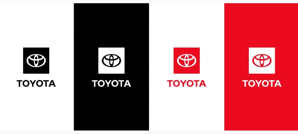
Check out the brand style guide for Toyota. They have guidelines on how it will appear horizontally and vertically. Plus, they indicated dimensions for different platforms and colors.
Since you know the elements of a good logo design, see how some brands used (or didn’t) the aspects of logo design on their rebrand.
Bad and Good Examples of a Logo Redesign
Bad: Kraft
Kraft decided to change its recognizable red hexagon logo to a typographic logo. It looks like a spark. It doesn’t look appealing and doesn’t connect with their brand well. But Kraft reverted to their original logo with changes in the Kraft font.
Good: Google
In 2015, Google updated its logo to give it a more modern look. Google made the right decision in modernizing their logo design. Sergey Brin, the co-founder of Google, designed their first-ever logo on Gimp. The company kept the original concept by making it friendlier and approachable.
Bad: Capital One
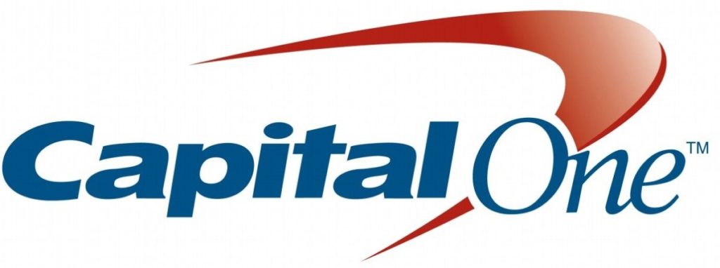
Capital One had a simple wordmark logo before its rebrand. However, in their new logo design, it looks like Capital One added a boomerang. It doesn’t look like a professional finance company logo. The finance company did redesign the logo with a flat look.
Good: Mastercard
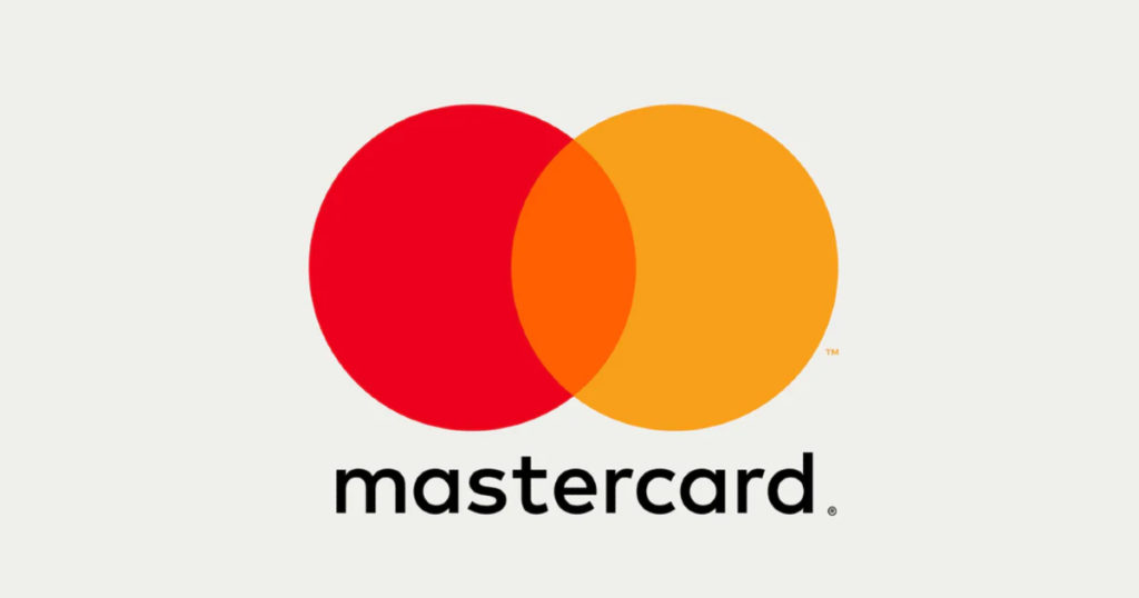
Pentagram redesigned the new Mastercard logo for the digital age. The logo follows a minimalist look that signifies “simplicity, seamlessness, and connectivity.” Plus, with the new logo, Mastercard can remain a trusted financial brand.
Bad: Gap

Gap wanted to make changes to its logo. The apparel company changed its well-known logo by sticking to a wordmark one with a blue square. The redesign didn’t sit well with audiences that Gap eventually had to revert to their original logo.
Good: Dunkin’
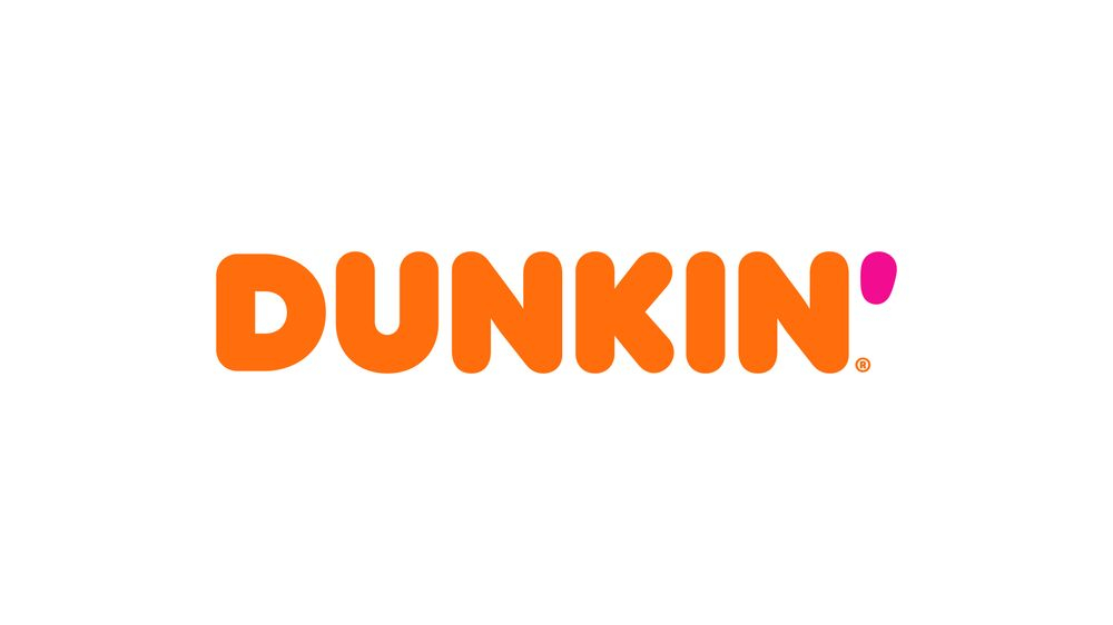
Dunkin’ changed their logo design by dropping the word, Donuts. They did this because Dunkin’ sold other food products too. They don’t lose their overall branding identity either even after eliminating the word “Donuts.” It was still the famous rounded orange wordmark.
Bad: Pizza Hut
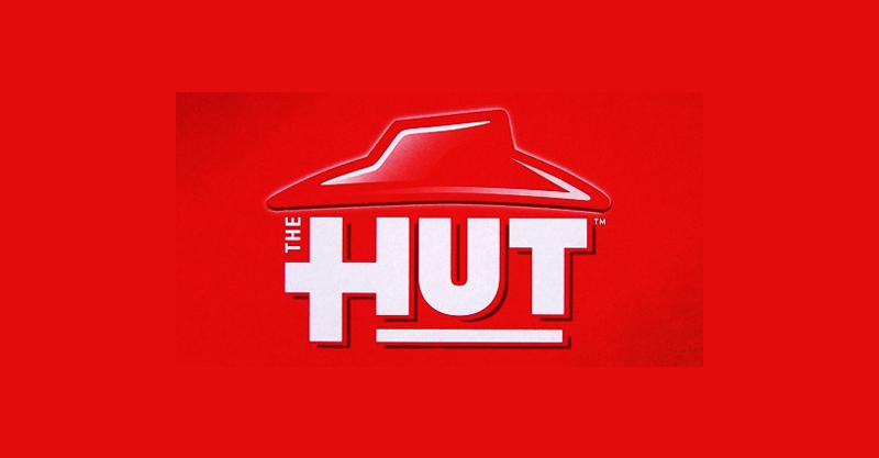
In 2009, Pizza Hut rebranded into The Hut. That’s it, just The Hut. They even updated the logo to read it as The Hut. It received backlash, and Pizza Hut claimed that it was only a marketing ploy. The pizza chain did use the prototype logo in several stores. However, they eventually kept the logo with the yellow line under Hut.
Good: FedEx
Federal Express made the right call in changing their logo in 1994. In 1973, it was a diagonal Federal Express logo that was apt at the time. They did introduce a logo in the early ‘90s. But it was the 1994 logo that stuck until today. It was a simple wordmark logo that had two colors. What makes it one of the best professional logo designs is the hidden symbol.
If you look carefully, you’ll see an arrow between Ex. The arrow symbolizes speed and accuracy.
Bad: Zara
Zara redesigned its logo in 2019. Not everyone was amused over the kerning (spacing of characters) of the Zara design. During this time, fashion brands have made changes over their logos too. So, Zara also followed trends. But it wasn’t as well-received as its competitors. The fashion brand kept its design despite the public’s negative feedback.
Good: Starbucks
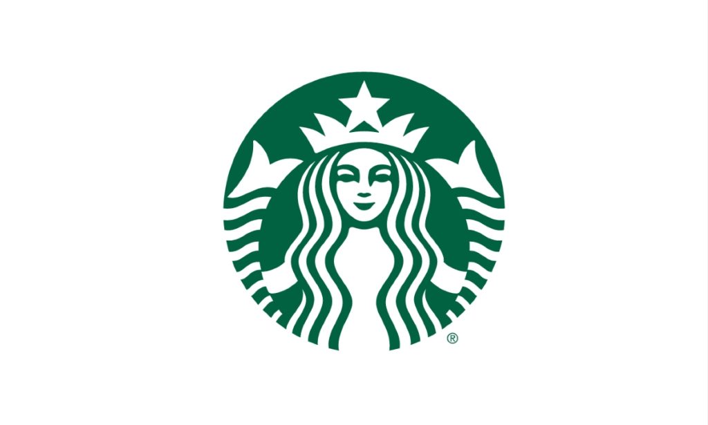
Starbucks updated its logo in 2011 with a flat design. They kept the iconic siren because she’s a memorable emblem. The coffee company dropped Starbucks on the logo. Since Starbucks has established its connection with its audience, the company didn’t make a drastic change in the design. They kept the essence of the design but made it modern.
How Can Lead Pixels Produce a Professional Logo Design
You shouldn’t have to pay thousands of dollars for a professional logo design. Save yourself the trouble of redesigning a logo too. Partner with a graphic design service that will create a logo design you’ll love.
Lead Pixels is an unlimited graphic design service. By using a subscription-based graphic design service, you can request any type of design on a flat rate.
The designers at Lead Pixels are vetted, and only 2% of the industry are part of the team. So, you won’t have to worry about MIA freelancers. For any design type you request, you can expect reliability, trustworthiness, and professionalism.
Plus, unlike freelancers and other graphic design services, you can revise the logo until you’re satisfied. You have unlimited revisions at no extra cost.
Get started on a Lead Pixels plan today!
Related Post


Recent Comments
Interdum luctus accu samus habitant error nostra nostrum
Fletch SkinnerInterdum luctus accu samus habitant error nostra nostrum
Chauffina CarrBloke cracking goal the full monty get stuffed mate posh.
Fletch Skinner
![]()
Lead Pixel is an on-demand graphic design service that caters to fast growing teams, marketers, and agencies.
Copyright © 2020 Lead Pixels
Company
Resources
Our Capabilities
Community Initiatives