21 Oct

It can be daunting to know that there are over 3.5 billion social media users worldwide. It may be difficult to reach your target audience organically. That’s why most would opt to use ads to get more page likes or follows.
However, for some, social media is a platform to increase brand awareness and interact with users. To maintain this, a business must post status updates, videos, and photos regularly. Even if videos get more love, compelling social media graphic design performs well too.
Increase engagement rates by applying the ten elements of graphic design on your social media posts.
1. Brighten with Colors
If you’re posting on social media, you should always aim to stop people from scrolling on their feed. This way, they can engage with your brand by liking or commenting on the post. Posting a status message won’t work anymore. You have to accompany it with images. By doing this, you need to post a well-designed image.
Colors can help you achieve that.
You can use a color palette. Color palettes will provide harmony in the design that will be pleasing to the eyes.
Check out these sites to find which color palettes you could use for your social media graphic design:
- Color Hunt
- Coolors
- Paletton
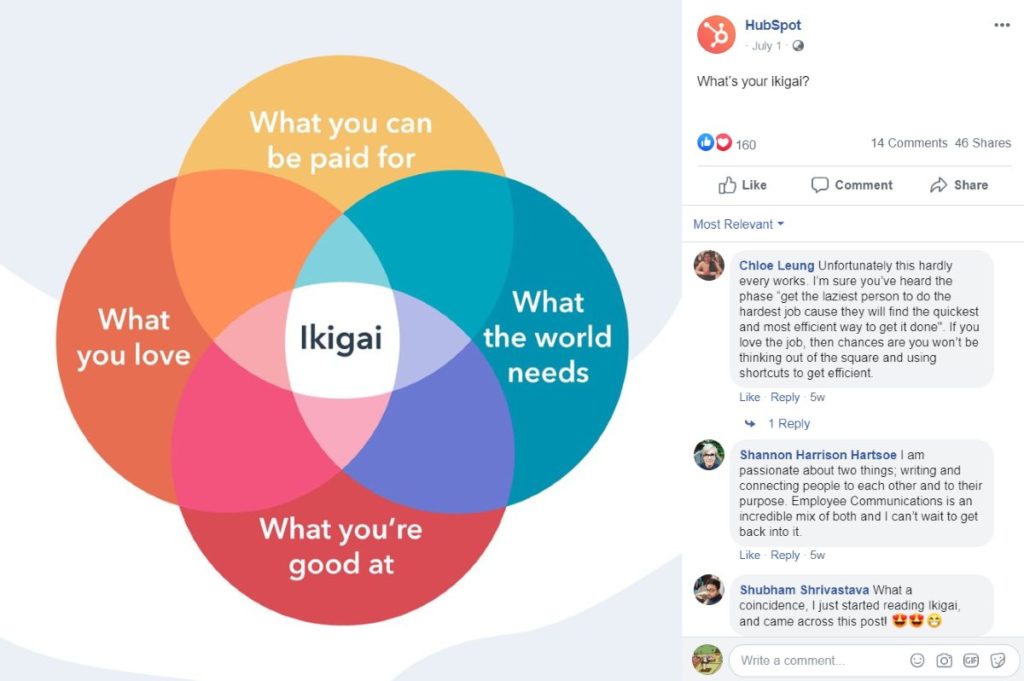
You can take this example from Hubspot. They used different colors on the Venn diagram. The color combos don’t hurt the eyes. Plus, they even blended the colors.
2. Make an Impact with Font & Typography
You can post text graphics on social media like:
- Quotes
- Reviews
- Tips
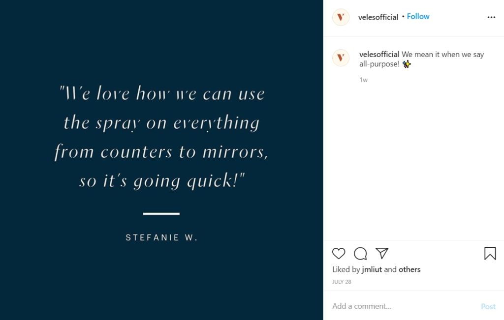
Look at how Veles used a review to post on their social media page. That’s how you can apply text on graphic design. It’s much better than posting a screenshot of a review.
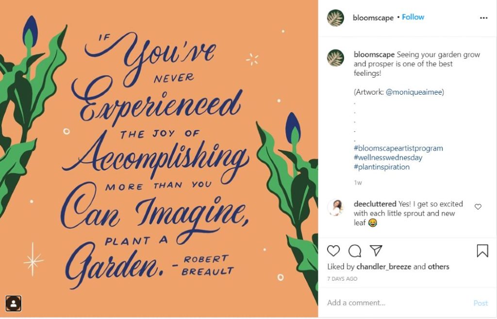
Take those up a notch by making it as typography. Bloomscape (artwork by Monique Aimee) posted this image on their Instagram account. You can liven up the text and make it captivating.
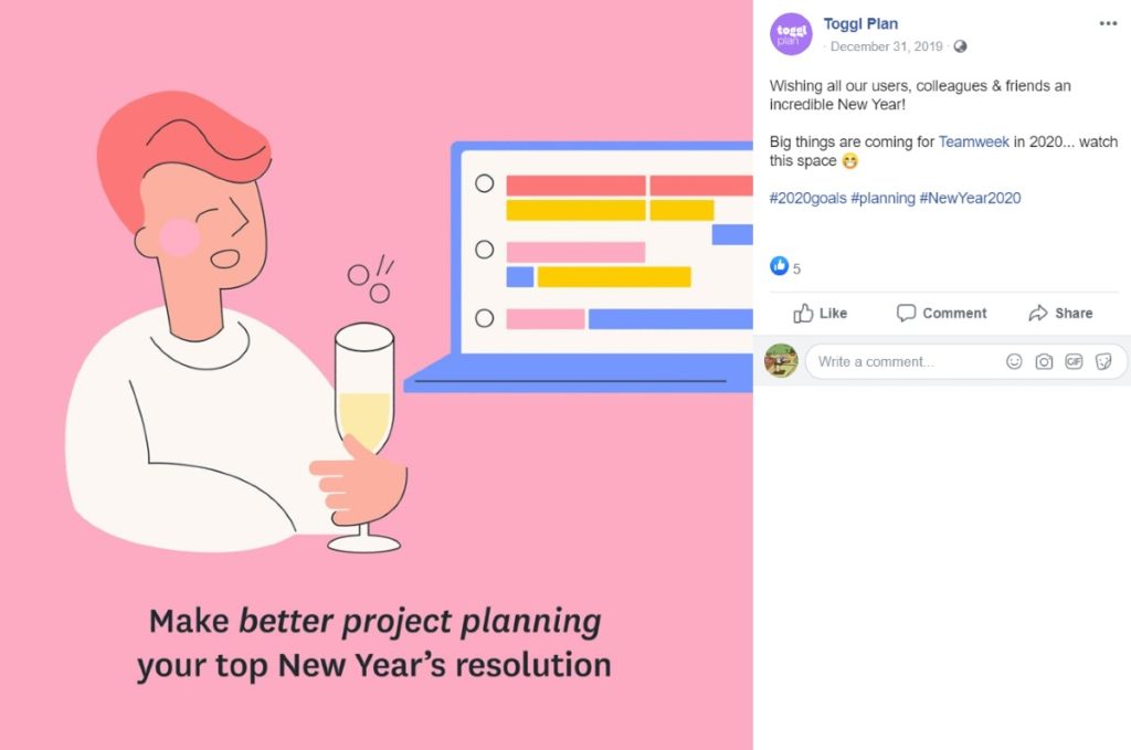
Here’s an example where you can use font elements like italics, bold, and underline. Toggl Plan used italics to emphasize better project planning. It’s a way to stress the point of using their product.
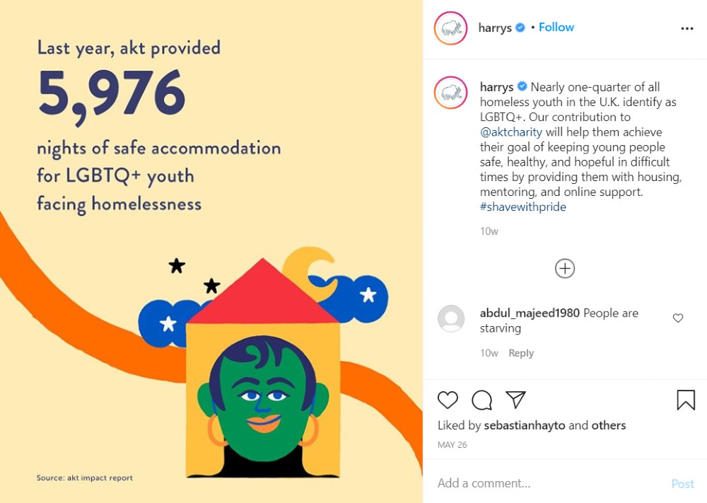
Check out another example from Harry’s. In their case, they emphasized the number on the Instagram post. Numbers are an excellent way of capturing your audience’s attention.
3. Utilize White Space
White space (negative space) is an essential part of any good graphic design. This will make your design look clean and put focus on the positive space.
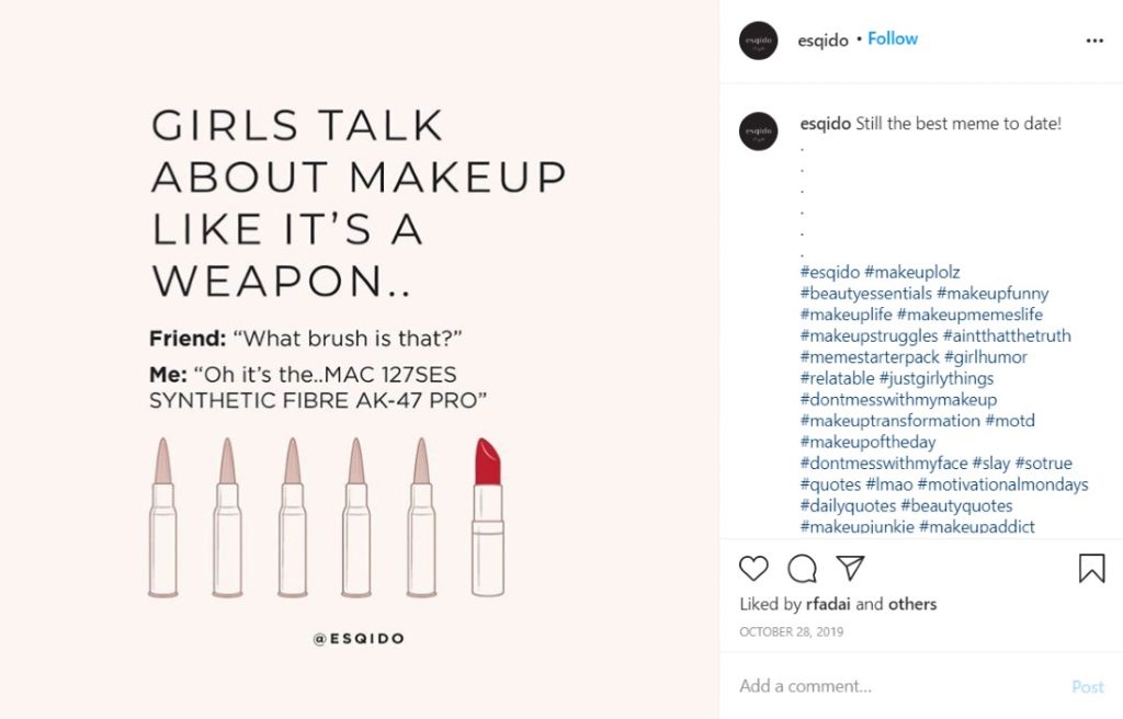
Observe white space by checking out this example from Esqido. They put all the design elements in the middle, giving it a cleaner look. Bonus points for them for using hierarchy as well. So, they enlarged the text to grab the attention of their followers. They also used bolded text to emphasize who was speaking in the scenario.
4. Visualize Text
Bring your social media graphic design to life by adding imagery. You could do this by adding icons or illustrations.
Icons are a visual representation of text. Instead of using the word “phone,” you can replace it with a photo of a telephone. We process images faster than text, so it’s only apt to add icons to your design.
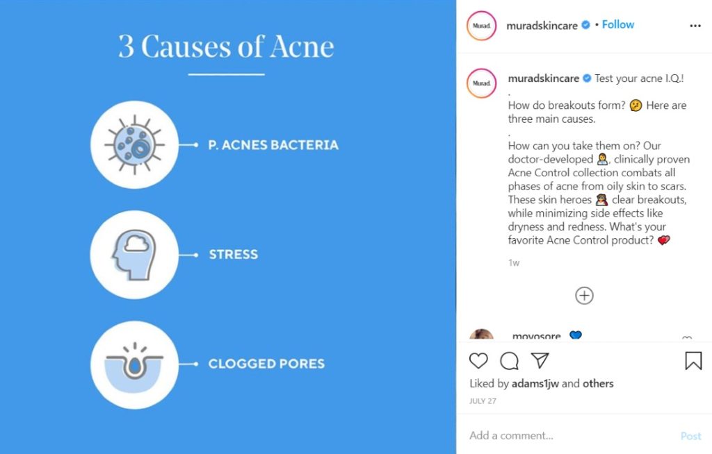
This post from Murad Skincare is an excellent example of using icons. Even if there are labels on it, it still helps to visualize information.
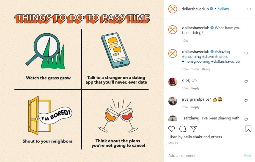
Another way of visualizing text is to add an illustration. In this example from the Dollar Shave Club, they supplied appropriate illustrations for their copy.
5. Follow Elements of Visual Hierarchy
Graphic designers follow visual hierarchy when creating their designs. By following visual hierarchy, you can create order, structure, and alignment. You have other elements like proximity, repetition, and texture.
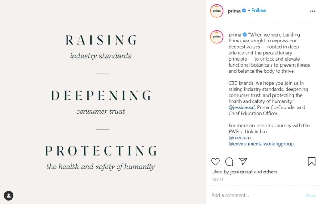
If you want to establish order in design, you could use lines. Here’s an example of how you could use lines. Prima uses short lines to separate points. It’s easier to follow the flow and know the essence of the message.
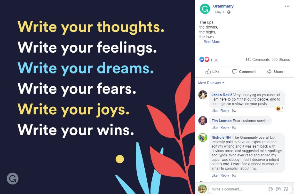
Another way you can integrate order into your design is to align elements. It could be shapes, text, or images. It gives it a much cleaner look. Grammarly applies this to one of their posts. It looks neat and readable.
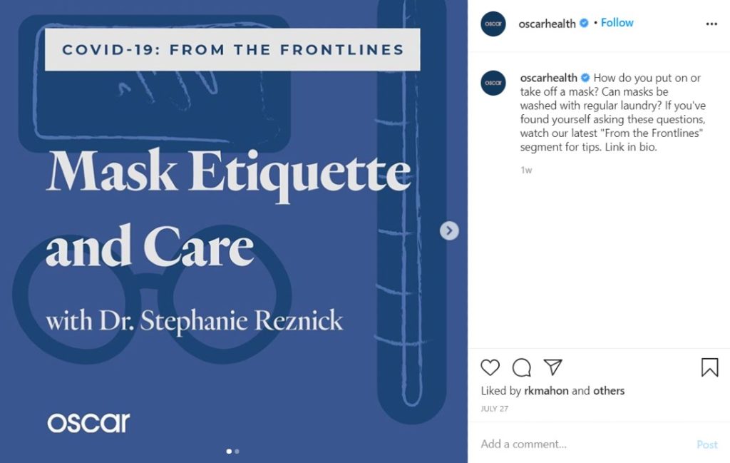
You can also check out the graphics on the Oscar Instagram page. For their “From the Frontlines” series, you’ll see how they organized the text. The header has a white fill. They enlarged and bolded the title of the segment. Finally, they used a subheading without any emphasis.
6. Observe Contrast
Engage your audience by adding contrast to your design. It can be subtle, like using two contrasting colors. Perhaps, it could be by using large and small fonts. You can even try two different fonts that might go well together.
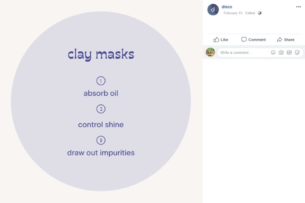
This example of Disco is one example where you can play with fonts. They use a playful font for the heading and numbers and use a more professional one for their points.
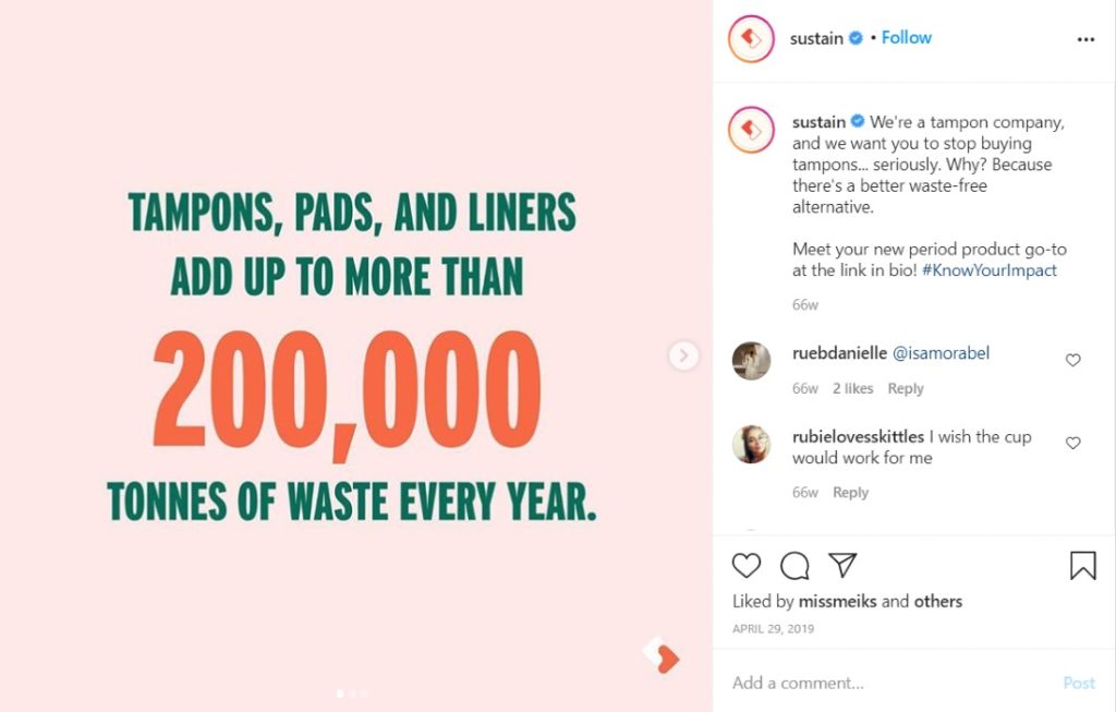
Colors are also another way you can try out a contrast. Take a look at how Sustain uses contrast on their social media graphic design. They made sure to use a striking color for the data and used the opposite color for the additional information.
7. Keep it Consistent
Integrate your branding into any social media graphic design. You want to make sure that your audience recognizes your brand across different channels. You should add the colors and fonts (even illustrations) that most would associate you with.
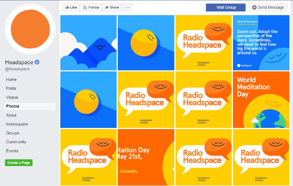
Headspace is a great example of this. Notice that they use orange since it’s part of the branding. Not only that, but they also use yellow, white, and blue on other graphics. Plus, they use their recognizable illustrations and text as well.
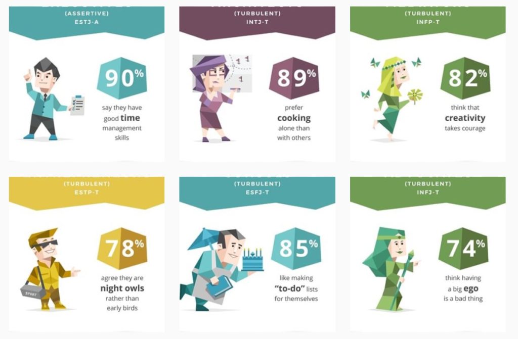
For copyright purposes, you can even add your logo or website, so people know the source of the graphic design. An example of this comes from 16 Personalities. They use the same illustration type. But, they differentiate the 16 personality types with data, color, and illustration personality.
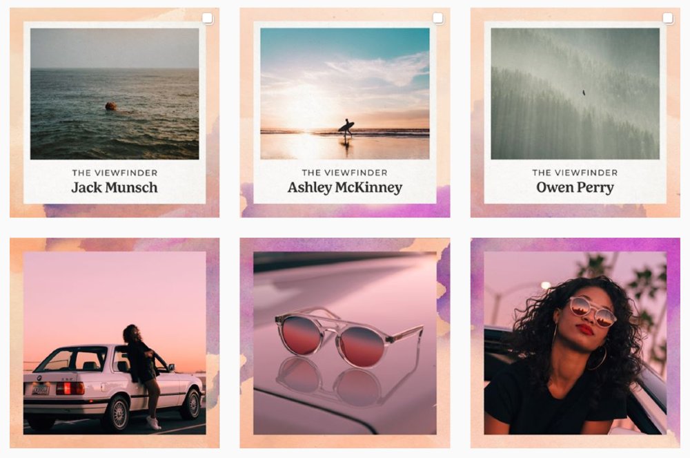
You can also make things consistent by using different colors and text but have the same design theme. Tens illustrates this example. They use a background and place their photos atop it. If you also notice it, they have a theme and connect the backgrounds.
8. Be Creative
Even if consistency is key, you may have to change your social media graphic design from time to time. People might get bored with the same aesthetic or content, and you could sneak in different designs and photos. It’s to show that you’re not sticking to one type of posting. Plus, it’s a way for your target audience to get to know you better.
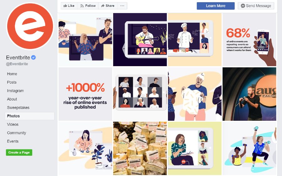
Take a look at Eventbrite’s photo feed. They did stick to the theme of posting illustrations. However, aside from sharing photos from events, they also uploaded images with statistics.
Make sure that you’re also posting relevant information and solutions. This way, they think of you as an expert on the subject matter. Plus, you could build your trust with them.
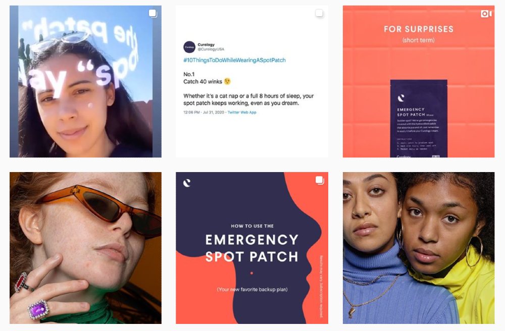
You can take a look at Curology as another example. Since they focus on skincare, they post products, models, and helpful information. Aside from that, they also post reviews and before and after stories to show that their products work.
9. Consider Flat Design
One of the most commonly followed graphic design trends is using flat design. You can apply this to illustrations, shapes, and icons. It makes concepts clearer, looks neater, and enhances readability.
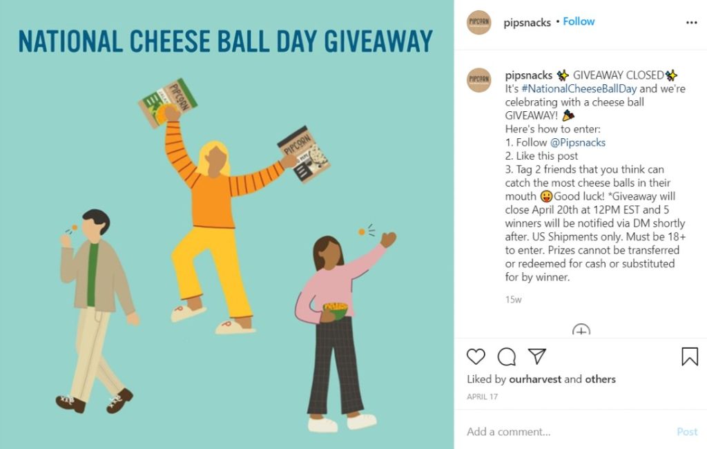
Pipsnacks uses flat design for its illustrations. It improves the design because it tells a story, plus they get straight to the point.
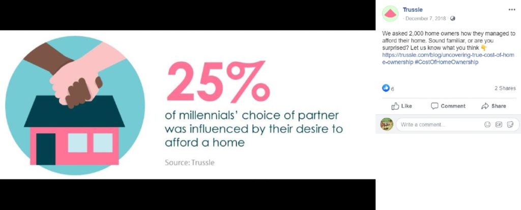
Here’s another example of a flat design you can follow for your posts. Trussle uses an illustration to visualize the data they posted. They also used text that was readable too.
10. Apply Asymmetry
Asymmetry has been an ongoing design trend. The idea of asymmetry is to shift our view, making it more engaging to look at. Most would apply asymmetry on websites, but it’s also present on social media.
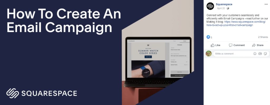
Look at how Squarespace used asymmetry for this post. Instead of making the photo look rectangular, it looks more diagonal. It’s captivating and intriguing at the same time.
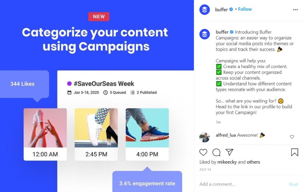
Here’s another way you can observe asymmetry in your graphic design. Buffer didn’t align the three images inside a shape. Plus, it seems they also told a story through the graphic.
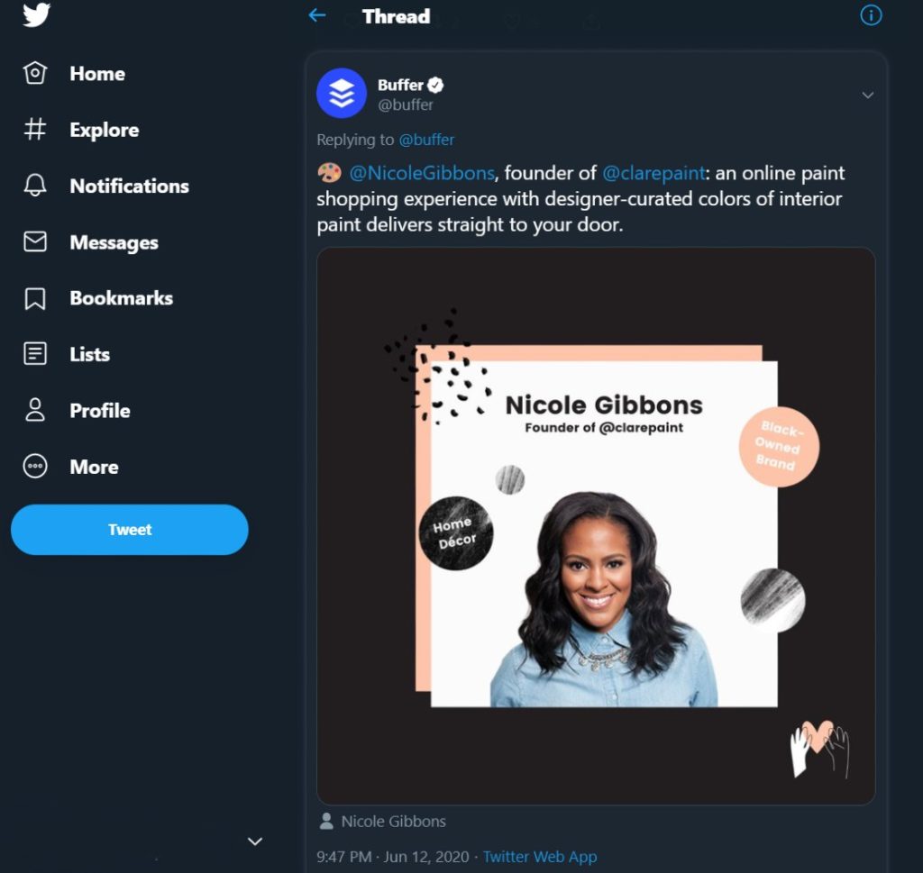
This is one of the most common asymmetry design types you might see on websites. Buffer layered the photo and placed the circular icons in different areas.
How Can Lead Pixels Help You?
Don’t let your social media efforts go to waste. Post compelling and engaging graphics that your followers or fans would love to see. Who knows, you might get more likes and comments. Eventually, you’ll have more people following your page. Stand out from the crowd by using Lead Pixels.
Lead Pixels is an unlimited graphic design service. You can request graphics like website design, ad design, and more! Subscribe to a Lead Pixels plan today and increase your follower count and engagement rates.
Related Post


Recent Comments
Interdum luctus accu samus habitant error nostra nostrum
Fletch SkinnerInterdum luctus accu samus habitant error nostra nostrum
Chauffina CarrBloke cracking goal the full monty get stuffed mate posh.
Fletch Skinner
![]()
Lead Pixel is an on-demand graphic design service that caters to fast growing teams, marketers, and agencies.
Copyright © 2020 Lead Pixels
Company
Resources
Our Capabilities
Community Initiatives