26 Oct
It’s estimated there are a whopping 20 million ecommerce sites. That large number may make you reluctant to launch yours. But don’t let that number stop you. You can still find leads and customers by promoting your website.
Once you start advertising or marketing your products through social media, email, or ad space, you can lead them to your ecommerce landing page. It will enable customers to learn more about your company and products. Eventually, it might prompt them to buy something from your site.
You need to make sure that you have a compelling ecommerce landing page design. This way, you can convert visitors into customers and generate more revenue from it.
Know what the benefits of a landing page are. Plus, learn what design elements you can integrate into a high-converting landing page.
What is a Landing Page?
Before you get started, let’s get you (re-)acquainted with the meaning of a landing page.
A landing page is a web page that aims to convert visitors into buyers. It’s made for marketing and advertising purposes.
What are The Benefits of Having a Landing Page?
Promote Your New Products and Offers
The landing page can serve as a channel to promote your products on your website. After all, one of your goals is to sell your products. It’s only right that your landing page features the products you want customers to buy.
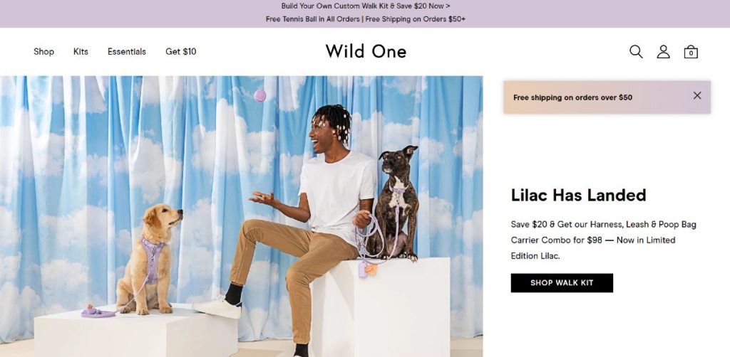
You can also try out offers on your landing pages. Try it out as Wild One did. They promoted the new color of their leash, and customers can get a discount.
Increase Conversion Rates
Landing pages can increase conversion rates by up to 2.35%. It may be a low number, but if you have between 10 to 15 landing pages, you raise your chances of getting more leads.
Another component of increasing conversion rates is to conduct A/B testing. It’s to see which page performs best. This way, you can gauge what your audience likes. Plus, by testing different designs, you can generate 55% more leads.
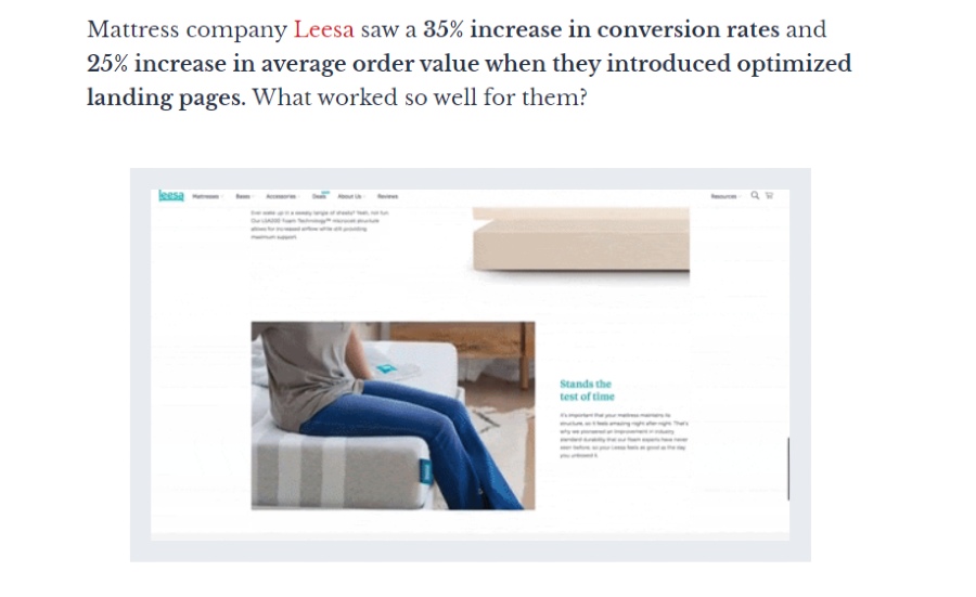
Leesa was successful in running their landing pages. They increased conversion rates by up to 35%. According to CXL, Leesa placed social proof, triggered urgency, and used hero images, among other things.
Get More Leads
Most ecommerce websites would persuade a visitor to buy something through a Shop Now or Discover call-to-action (CTA) button. In some cases, ecommerce websites may also use the landing page to get leads through email.
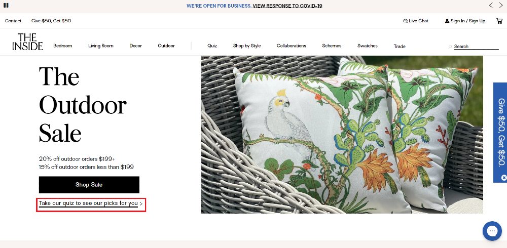
An example of subtly getting leads is through a quiz, like how The Inside did for their landing page. Let your visitors answer a series of questions and have them provide their email address.
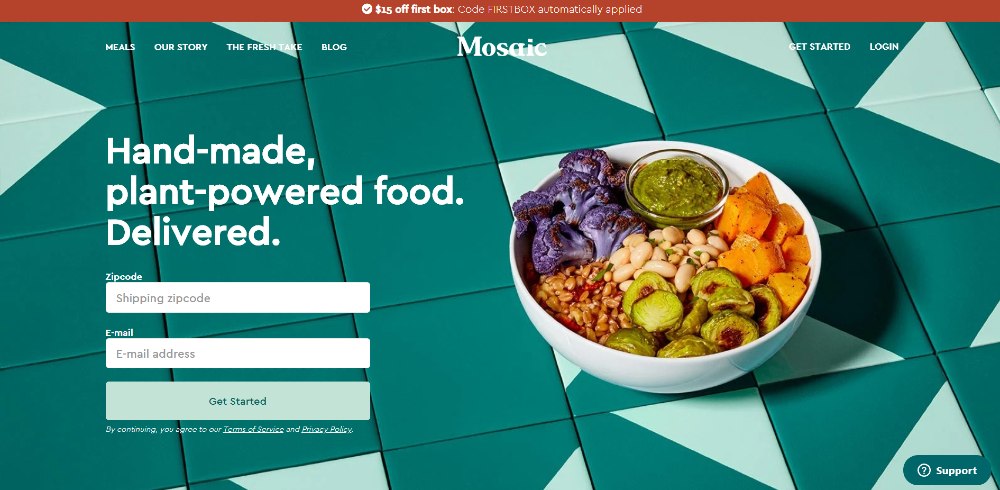
You can also have a form on your landing page above the fold like this one from Mosaic. All your potential lead has to do is to fill in their details and submit Get Started. No need to go through a quiz or consultation. This works best if the customer has already decided to push through with a purchase.
Introduce Visitors to Other Channels or Platforms
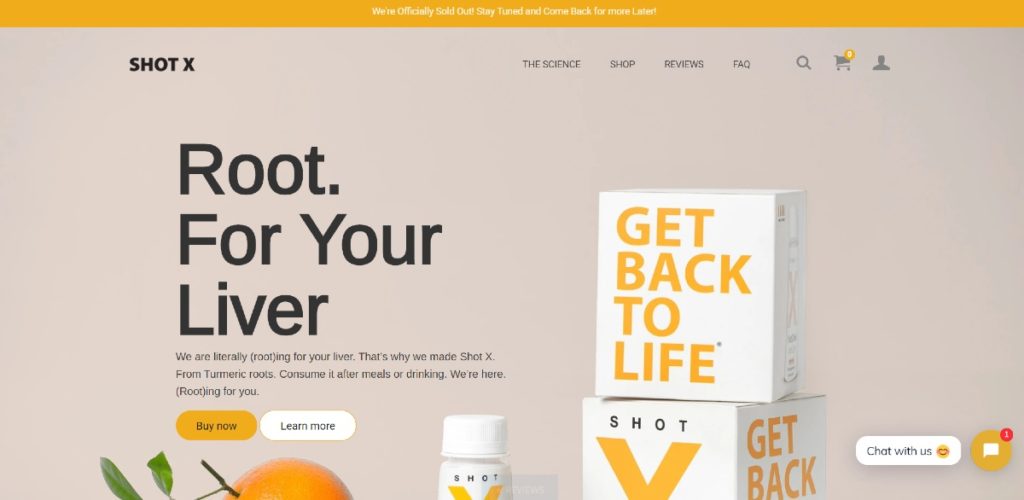
In line with getting leads, some ecommerce sites would redirect visitors to explore the site. Sometimes, they might have yet to learn about the product. So, it’s good to provide a link to a guide or information like this one from Shot X.
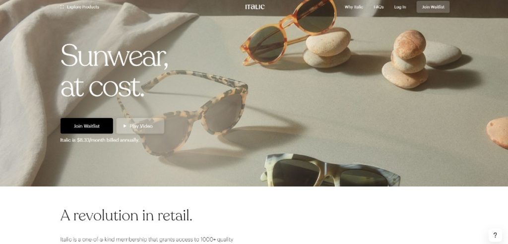
Those who have yet to launch their website can have potential subscribers become part of a waitlist, just like this one from Italic. This way, they can become part of your email subscription list.
Improves Credibility
You want your ecommerce website as one that provides solutions to your customer’s problems. Plus, if you add social proof on your landing page, you can further establish trust. Social proof is how people can gauge something based on people’s actions.
What types of social proof can you add on your ecommerce landing page?
- Reviews/Testimonials
- Awards
- Featured Ins
- Endorsements from Famous People
- Number of Customers or Users
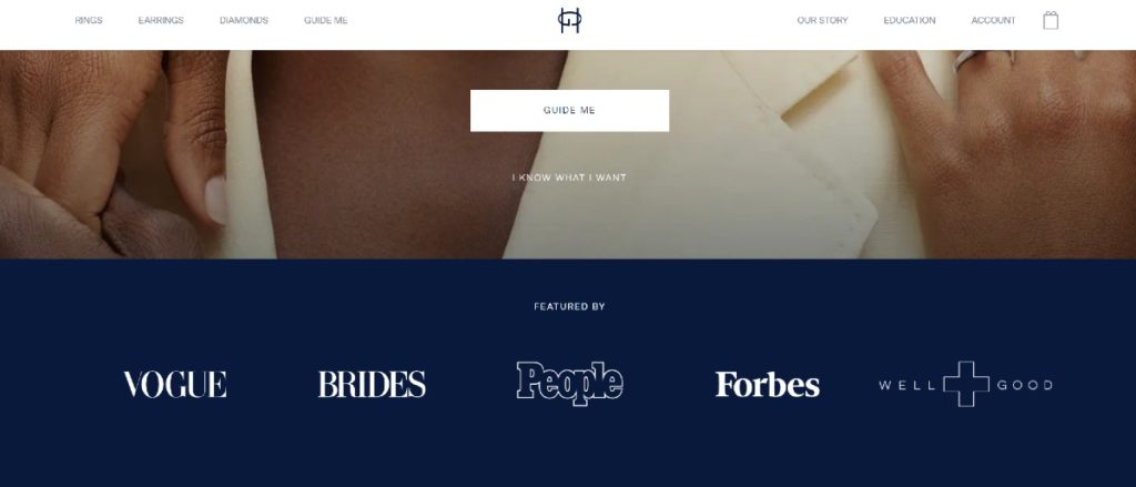
You can check out this example from Great Heights. They added logos of sites where their products were featured in. It’s to know that legitimate sources like Vogue, Forbes, and Brides can vouch for their products.
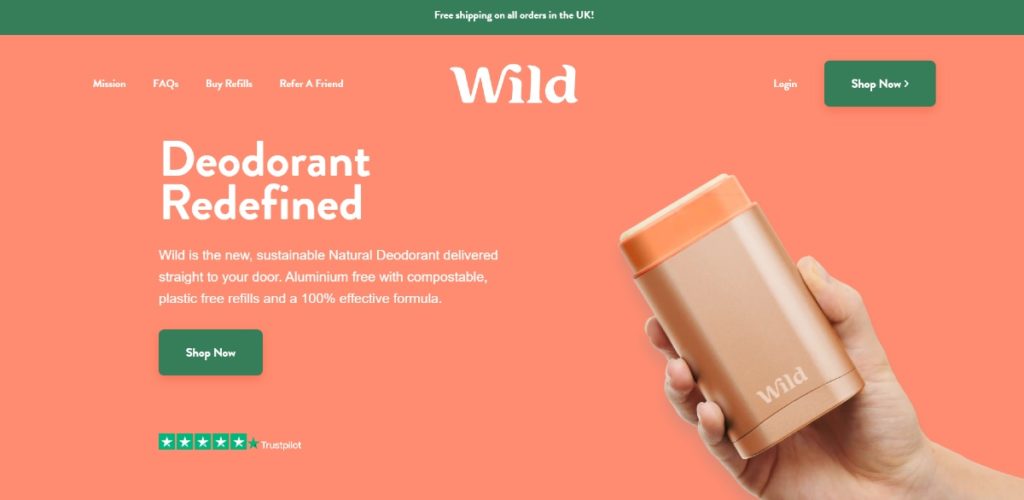
You may also integrate social proof above the fold like this one from Wild. The reviews blend well against the orange background. It’s also clickable, so that visitors can read the reviews left by their customers.
How to Level Up Your Ecommerce Landing Page with Graphic Design
Reduce bounce rates on your ecommerce landing page by sprucing it up. If your landing page looks dull, expect customers to close their tab. Here are six ways you can spruce up your landing page.
1. Hero images
A common best practice on any ecommerce landing page is to add hero images. A hero image is an image that will make your visitors check out and (maybe even) click on the landing page. Eventually, they might browse on your website.
Here are types of hero images you can use for your landing page:
- Product
- Emotion
- Founder
- Contextual
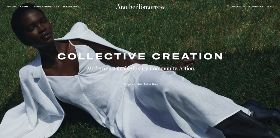
Check out this example from Another Tomorrow. It’s a mix of a product and a contextual hero image. It’s an excellent way of using a hero image because it might entice people to buy their products.
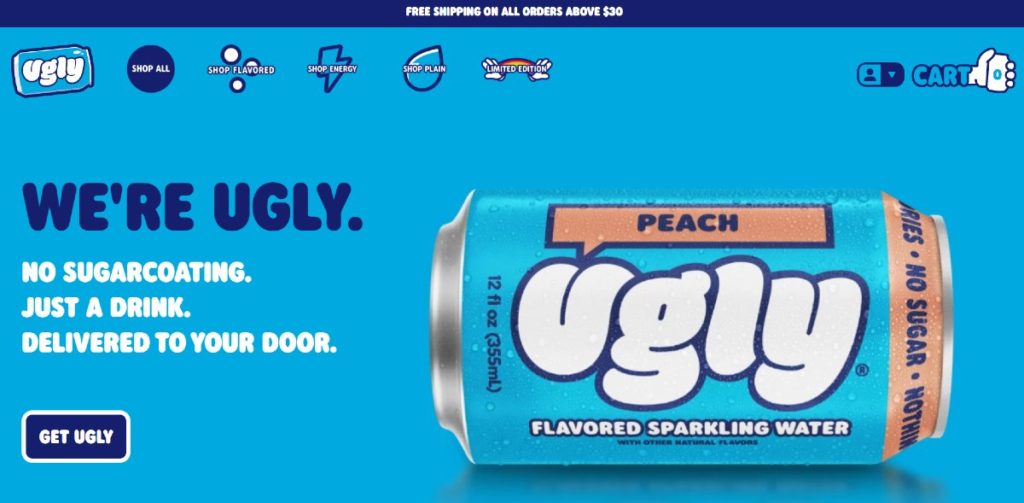
You can also get inspiration on how Ugly Drinks designed their landing page. They uploaded a can that isn’t upright and has condensation as well. It’s an unusual yet intriguing photo.
2. Illustrations
An emerging graphic design trend is the use of illustrations. Even notable companies like Slack, Uber, and Dropbox use illustrations. Brands use illustrations to tell stories, provide visual language, and improve consistency.
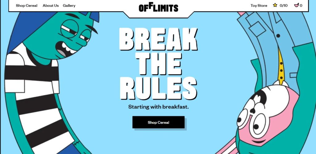
This example from Off Limits shows how you can make illustrations engaging. The illustrations are on an infinite loop animation. It can become hypnotizing and would enable a visitor to click on the CTA button.
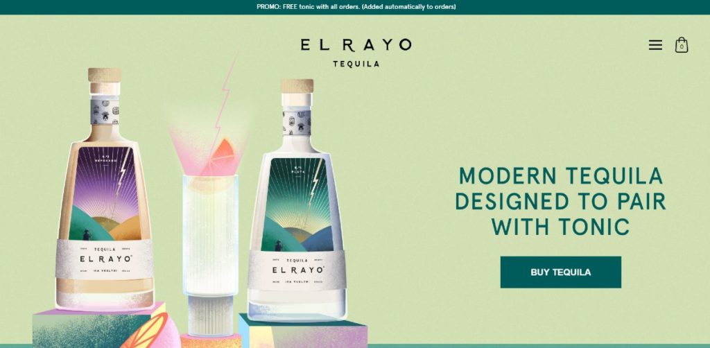
You can also emulate this example from El Rayo Tequila. They illustrated their products and some other items that involved drinking tequila. It looks aesthetically pleasing because of the color combination.
3. Colors
In terms of color, you have unlimited possibilities. Perhaps the splash of color on your landing page is the images you use. Maybe you’d like to go for earthy tones (since those are the trend).
You could use your brand’s colors on your ecommerce landing page. It can help establish your brand identity for new visitors.
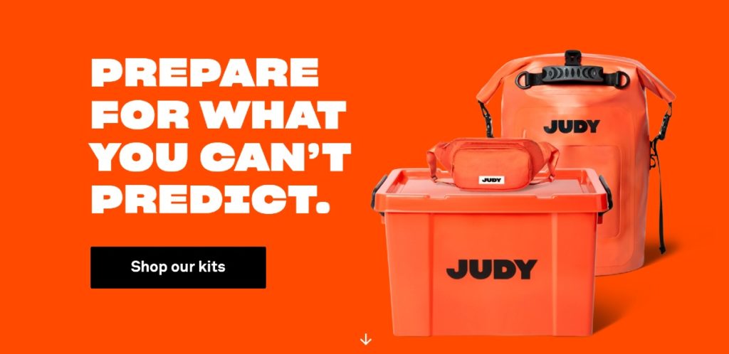
Check out how Judy uses their landing page. At first, it can be bright. But, that’s the thing. They use the orange associated with their business because this will help in brand retention.
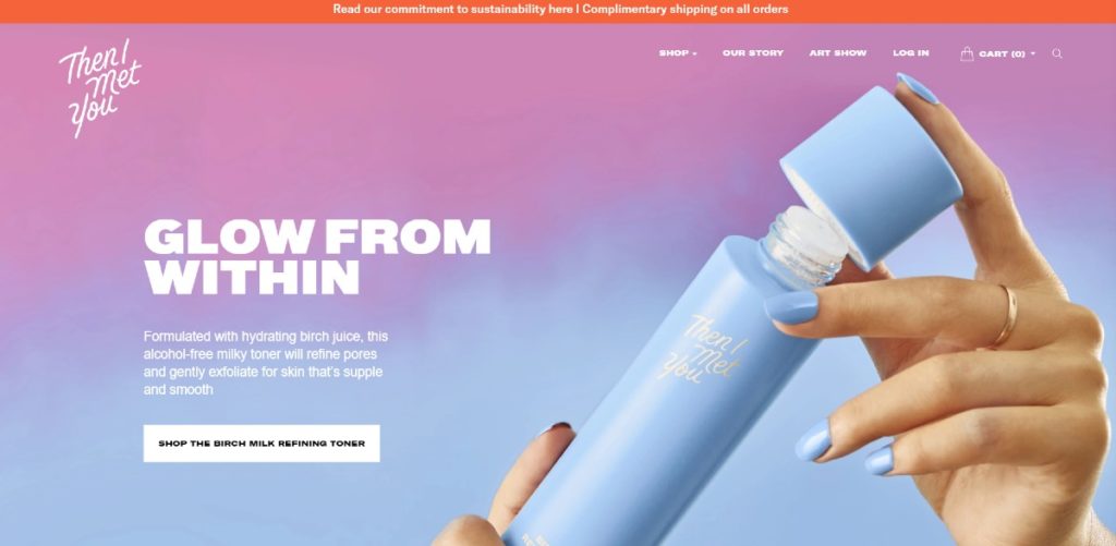
You don’t have to use your business colors on the landing page. Use gradients or palettes to make the landing page livelier. Look at this example from Then I Met You. They did integrate their branding on the gradient. It makes it look more pleasing to the eyes.
4. Font/Typography
You can entice your visitors by using appropriate fonts or quirky ones that draw people’s attention. Most ecommerce landing pages would mix fonts. It’s a way to emphasize text. This way, you can make your copy stick out.
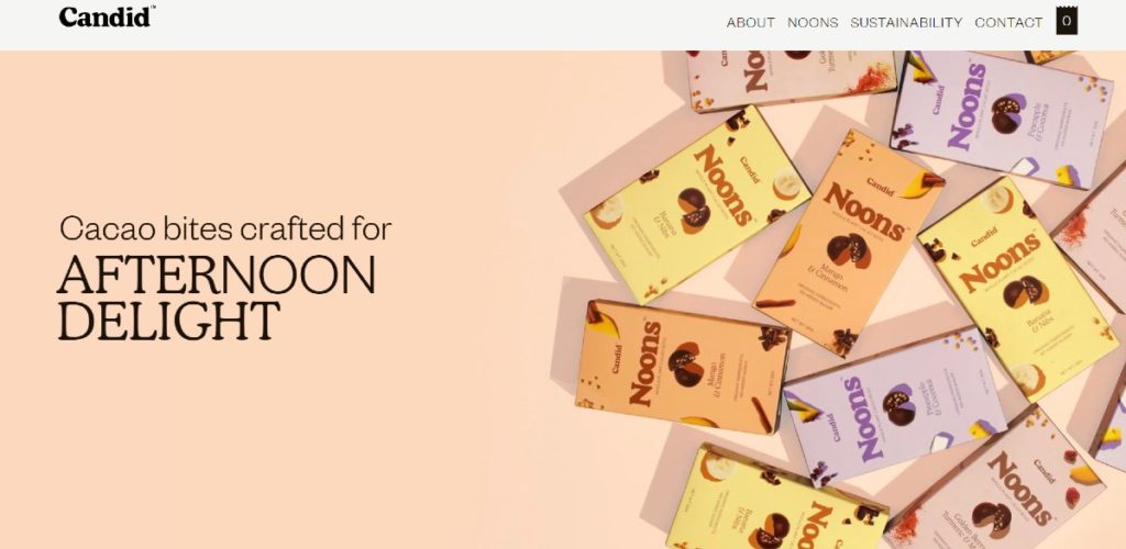
Here’s how Candid mixed fonts on their landing page. If you highlight the copy above the fold, you’ll notice they stress the words, After & Delight.
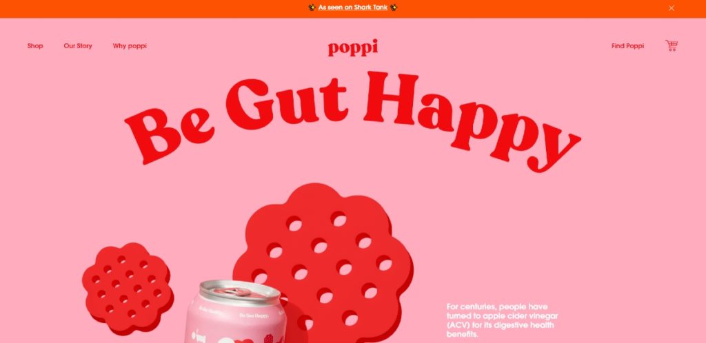
Rearrange text to make it more dynamic or animated. In this example from Poppi, they curve the text in a rainbow shape. It’s one way you can play with design elements.
5. Visual Hierarchy
You can follow elements of graphic design to make your landing page much more engaging and captivating.
One way of doing this is through a visual hierarchy. Graphic designers observe visual hierarchy because it follows order and structure.
One such principle is white space (negative space).
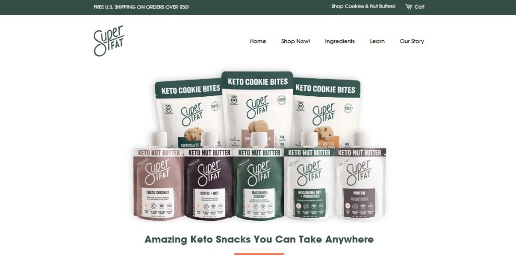
Take a look at this example from SuperFat. They utilized white space well so visitors could focus on the products shown on the landing page. It’s a plus they used high-quality images too, making it much more appetizing. It can convince you to buy their products.
Typographical hierarchy is also another element of visual hierarchy. Most ecommerce websites follow this because the copy is essential to landing page design. Headlines have larger fonts, followed by subheadings, then the CTA button.
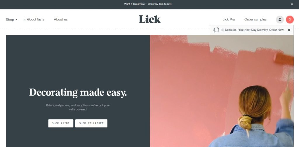
You can take note of how Lick used typographical hierarchy. Headlines can become more effective if the copy addresses a point. Lick did an excellent job of stressing that decorating can become easier. This will lead the visitor to read the subheading and click on one of their two CTA buttons.
Provide structure to your ecommerce website through a split-screen. It helps in providing different options and deviating from the norm.
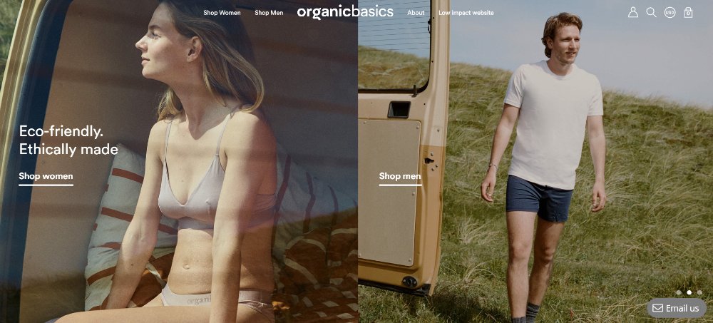
Organic Basics has three different split-screen images. Even if their site does focus more on women, they also cater to men in one of the landing page photos. If you also scroll down, they use grids to organize their website.
6. Asymmetry
Asymmetry also became a popular trend in web design. Ecommerce websites have hopped on the trend. Asymmetry can be effective because it can grab people’s attention. Plus, it’s expected to stay put as a trend for much longer.
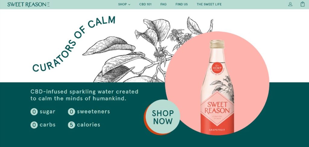
You don’t have to stick to the norm, like how Sweet Reason designed their landing page. Unlike most landing pages, it would use rectangular CTA buttons. Most of the copy would be on the left, and the hero image would be on the right. You can be creative with the design to engage your customers to look around the site.
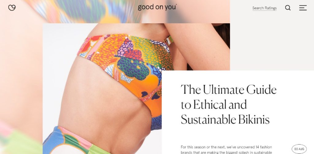
The advantage of asymmetry is allowing the user to scroll down and further navigate the landing page like this one from Good on You.
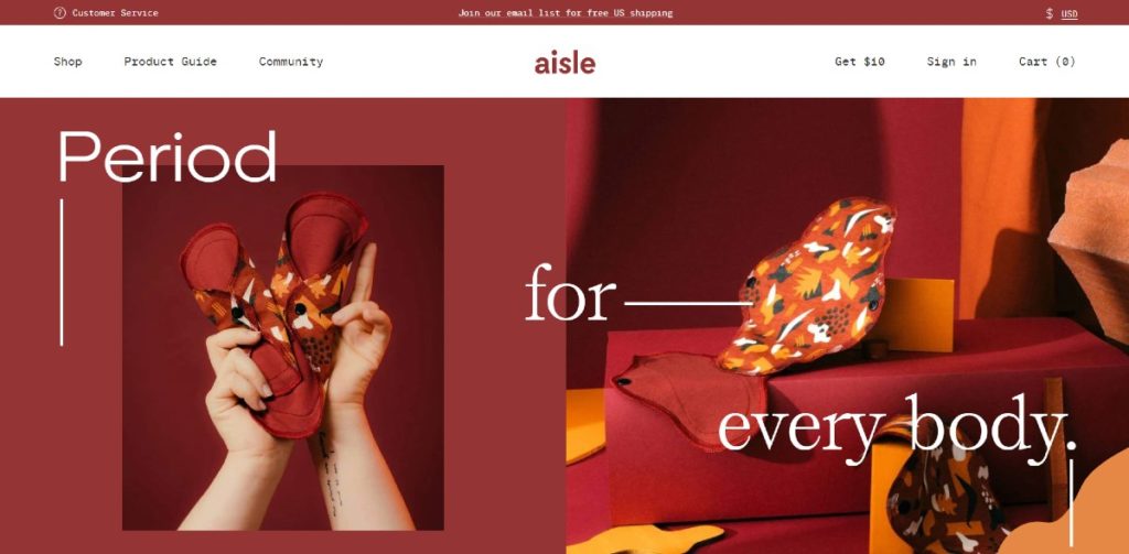
Aisle also follows an asymmetrical layout on their landing page. Despite observing asymmetry, Aisle follows a flow (pun, intended) by using directional cues.
Key Takeaways
The use of landing pages can boost sales and generate leads for ecommerce sites. Based on case studies and results, landing pages have helped bring success and increased awareness and reach. Get inspired by the examples above and stand out from your competitors.
That’s why you need a functional landing page. Start with conceptualizing a design that could boost product sales. Subscribe to Lead Pixels to get the designs you need for your website. You can request other visuals like ad design, social media graphics, and more. Get a Lead Pixels plan now and receive high-quality, compelling designs for your ecommerce business.
Related Post


Recent Comments
Interdum luctus accu samus habitant error nostra nostrum
Fletch SkinnerInterdum luctus accu samus habitant error nostra nostrum
Chauffina CarrBloke cracking goal the full monty get stuffed mate posh.
Fletch Skinner
![]()
Lead Pixel is an on-demand graphic design service that caters to fast growing teams, marketers, and agencies.
Copyright © 2020 Lead Pixels
Company
Resources
Our Capabilities
Community Initiatives