02 Oct
Although online ads have been the hot trend this past decade, traditional outdoor advertising is still an effective way to catch the audience’s attention. In fact, statistics tell us that billboard ads in the US have breached around 340-thousand-mark in the past couple of years.
Billboard advertising statistics aside, the significance of outdoor advertising can be easily appreciated every time you step outside. Can you name a billboard you saw on the road over the past weeks? That’s the power of traditional ads at play.
Sometimes, however, lack of planning can turn a billboard’s huge marketing potential into an epic fail.
Here are ten examples of hilariously funny billboard ads that flopped due to its design, copy, or placement. Read on and treat yourself to a good laugh!
1. YOLO
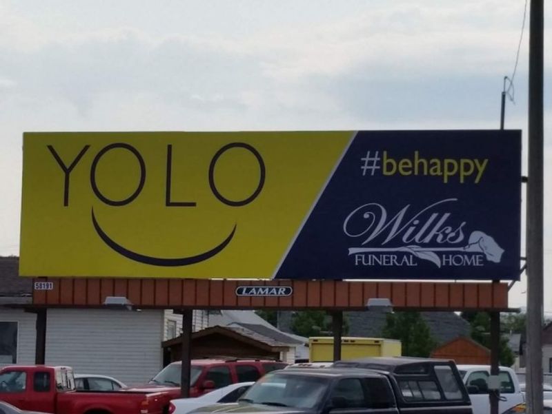
YOLO (you only live once) and #behappy, this billboard says. Because once it’s done, this funeral home is ready to be of service! The ad looks bright and happy until you realize what it’s actually advertising.
2. Sheet in the Pool
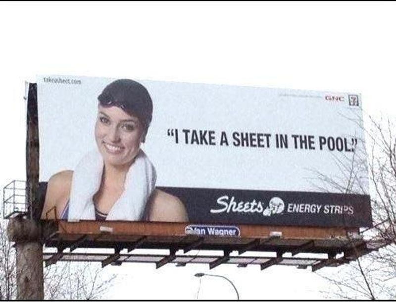
“I take a sheet in the pool.” Who wouldn’t burst out laughing at that? The ad is for a brand of energy-boosting tongue strips, thus the image of an athlete who most likely needs the energy to swim laps.
3. Stool Samples
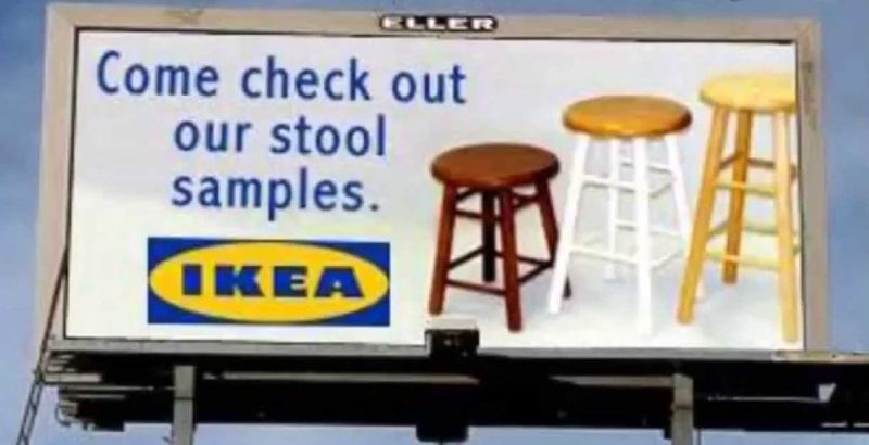
This one is an example of creative billboard ads that rely on an image not just for humor but also for relevance. Because, come on, reading the term “stool sample” doesn’t put a chair on your mind!
4. Scary Kids
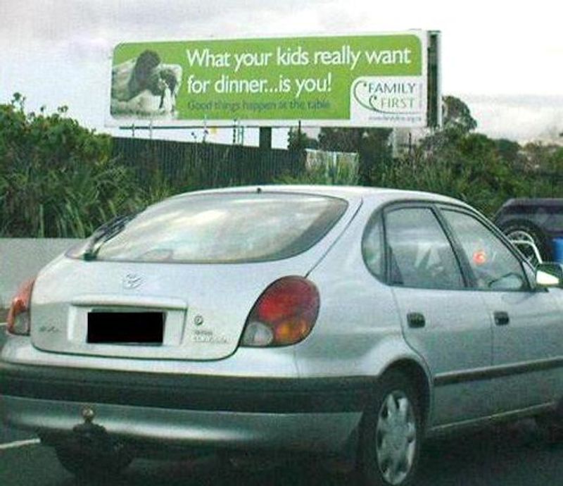
The copy says, “What your kids really want for dinner… is you.” The problem is, no parent would want to be their kids’ dinner! We know that the ad is trying to send a sweet message about family bonding over a meal. But the ad copy could’ve been composed better so that the kids don’t seem carnivorous.
5. Heart Disease and Sandwich
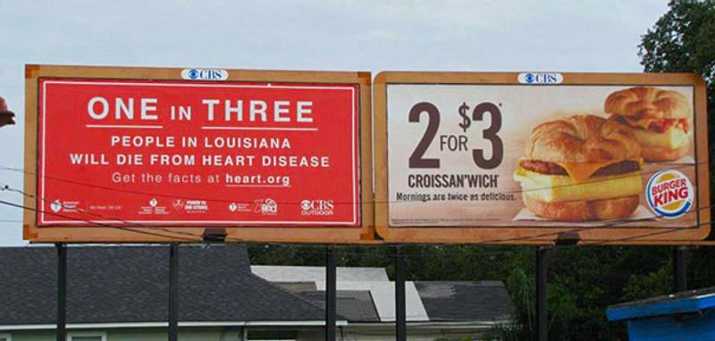
This example shows how placement can affect billboard advertising effectiveness. A 2 for $3 fast-food croissant sandwich ad hangs side-by-side a heart.org billboard saying one in three people in Louisiana die from heart disease. Talk about a quick reality check to snap you out of your craving!
6. Event Sponsors
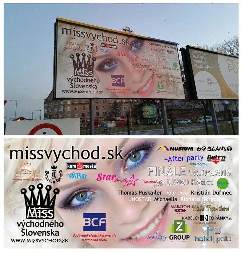
Sponsor logos are crucial in billboard ads because they let the viewers know that your event is supported by brands and organizations. However, you don’t need to put them right all over the face of your model!
7. Dream Anal-ysis
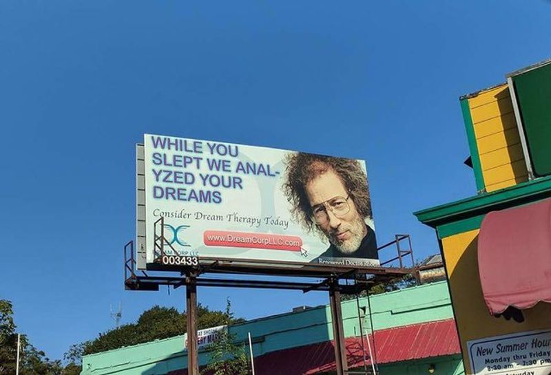
Dream analysis has never been this petrifying! The copy, “While you slept we anal-lyzed your dreams,” coupled with that picture, is just plain creepy. This example clearly shows why a professional layout is crucial to a billboard ad.
8. …Yet Something’s Still Not Quite Right.
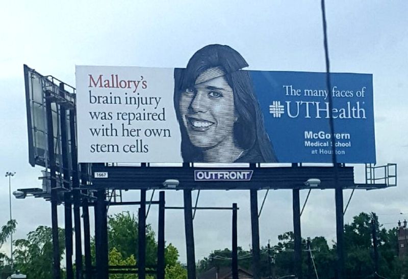
Other than design and copy, it’s also critical to pay attention to maintenance. This billboard about stem cell brain surgery looks hilarious because the top of the head looks broken!
9. Bland Flavor
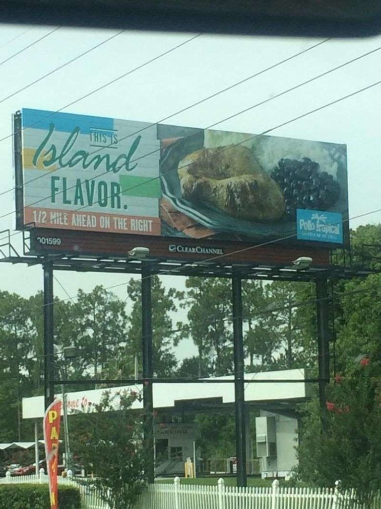
Any skilled graphic designer worth their salt would know which typefaces to avoid. For instance, the copy for this ad is supposed to say “This is Island Flavor.” However, it appears instead as “This is Bland flavor” because of the font! Now that’s a meal we won’t mind skipping.
10. 1-800-Call-
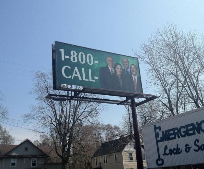
When it comes to short copy, this billboard is on point. The problem is, who are they, and what should you call them for? Talk about not getting your ad cost worth it!
Billboard Ads Dos and Don’ts
The examples above may tickle your funny bone, but it’s no laughing matter when it’s your business finances and reputation on the line.
To make sure you get the most out of your billboard ads cost, keep these dos and don’ts in mind.
Don’t:
- Overcrowd the image. The billboard size may be huge, but that doesn’t mean you need to overstuff it with too many words or elements. Remember, the audience might pass through it on the road, so the info should be easy to digest.
- Use low-quality images. Low-quality images will look drab on a huge billboard. Make sure to use high-resolution images to make the most out of the medium’s size.
- Take design elements for granted. You might think that you can wing a billboard design. Or maybe you think that asking a non-pro to create it is enough. However, several examples above prove the risks of not giving billboard design enough significance. For instance, just a little word hyphenation can do a lot to worsen the look and overall impression of the ad!
Do:
- Consider placement. As seen from the examples above, it pays to review the billboard’s location. It’s also ideal to know which ads your design will be placed along with in the same vein.
- Review your humor. There’s a thin line between funny-witty and funny-ridiculous. It’s easy to make a bad judgment call when you’re deciding alone. Run the copy over with the whole team or some family or friends to make sure that you’re on the right track.
- Use professional design. A billboard ad is a great chance to showcase your brand to a huge audience from all demographics and walks of life. That said, you’ll want to paint your brand in the best light possible through professional design.
- Keep it Simple. A study says the human brain can process images that the eye sees for as little as 13 milliseconds. That said, your design should be interesting enough to catch attention, but simple enough to be absorbed quickly. A pro would know how to create a visual that fits these requirements.
If you need high-quality billboard ads, Lead Pixels can help you out. Offering unlimited designs at a flat monthly fee, we can deliver all the visual assets you need at a fraction of the cost. That said, we can create not only billboard designs but also digital ads, social media posts, email templates, and whatever else you need for your business.
With our services, you won’t have to spend days hiring an in-house designer or looking for a freelancer. We’ll do the heavy lifting for you so that you can focus on more crucial business aspects to grow your brand.
![]()
Lead Pixel is an on-demand graphic design service that caters to fast growing teams, marketers, and agencies.
Copyright © 2020 Lead Pixels
Company
Resources
Our Capabilities
Community Initiatives