24 Aug

There’s a reason why 48 percent of marketers build landing pages for every new marketing campaign. That’s because they know how effective landing pages are in generating leads and sales. Check out the best landing page examples from brands, and you’ll see why they’re reaping the benefits.
Unfortunately, the other half of marketers don’t consider landing pages as necessary. According to MarketingSherpa, some marketers don’t utilize landing pages either because they don’t have time or have zero knowledge. I’d bet my bottom dollar they don’t know that long landing pages can garner up to 220 percent more leads. I bet they also don’t know that 52 percent of companies regularly test their landing pages for continuous improvement.
Landing pages differ from your website. The former’s primary goal is to convert, and that is why you should start including landing pages in your digital marketing approach. Here are six reasons why you need a landing page:
- Generates leads easily
- Quickly pitch your offers and collect sales
- Excellent for knowing your audience’s demographics and psychographics
- Lets you get to know your audience more
- Monitors and analyzes your marketing performance and campaign
- Perfect pair with other advertising channels
Before you roll your sleeves and brainstorm with the marketing team, here are some landing page examples to guide you. Learn what makes these landing pages successful and combine the different elements to generate leads and sales.
1. Drip
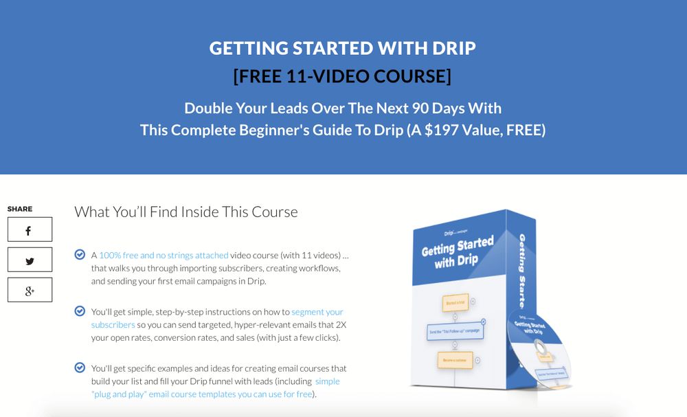
Who doesn’t love FREE stuff? This landing page knows what makes their audience tick, and that’s a free video course. But that’s not all. Drip also writes the value their audience is getting if they sign up for a free course. I’d take a free $197-video course any day!
Also, even though there are three paragraphs underneath, they’re very easily digestible. Drip highlights the primary keywords that grab attention.
2. Aura Transformation

Another free offering would surely make someone’s day. But this time, Aura Transformation does it differently. Instead of text, the company banks on a five-minute video to showcase all their happy clients.
Moreover, the landing page is also simple, with only the video and texts. The headline is also prominent, and the call-to-action button is eye-catching. It’s enclosed in a large button with a bright yellow color that sticks out like a sore thumb.
3. LandingFolio
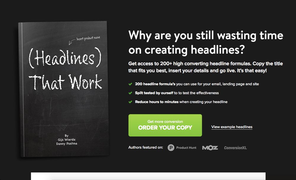
We have to commend LandingFolio’s landing page structure. It’s clean and organized, bearing essential information at the top down to the bottom’s less important details. The contrast is also excellent to make your readers stop and scrutinize the offer.
But the smartest tactic is how LandingFolio addressed their audience’s pain point right at the beginning. And true enough, people do waste time on creating headlines that don’t work. After addressing their audience’s pain point, LandingFolio positions its value proposition in a bullet-style format.
4. IDoneThis
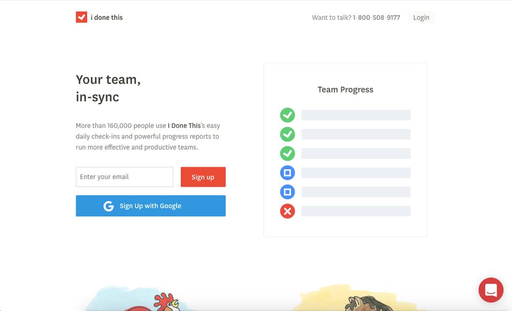
Never knew a three-word headline would be so striking! IDoneThis knows how to keep it concise and straightforward by saying, “Your team, in-sync.” This headline is straight to the point and is easy to understand as well. It targets companies’ issues about not collaborating efficiently.
Underneath the headline is also another striking figure of social proof. The number 160,000 can undeniably grab any entrepreneur’s or marketer’s attention. Imagine, if you sign up for their service, you’ll be one of the more than 160,000 clients with flawless workflow.
5. KientBoost
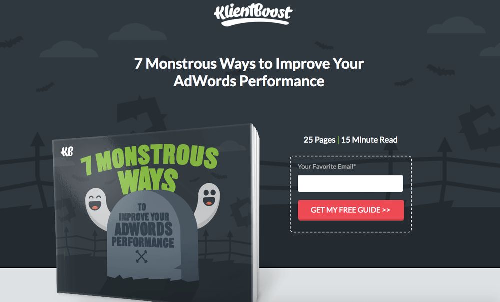
One crucial element of a landing page that makes your audience stop, read, and sign up is customized images. Whether you’re creating graphic designs or illustrations, images are excellent to add a punch to your landing pages. Although we see many text-based landing page examples, images tell a brand’s story differently.
And KientBoost banks on a Halloween-inspired graphic design to capture their audience’s attention. It’s also a nice gesture to let your audience know what they’re getting. And the details of the eBook help paint a picture for the audience. Twenty-five pages for a 15-minute read? Not bad! Sign me up!
6. James Clear
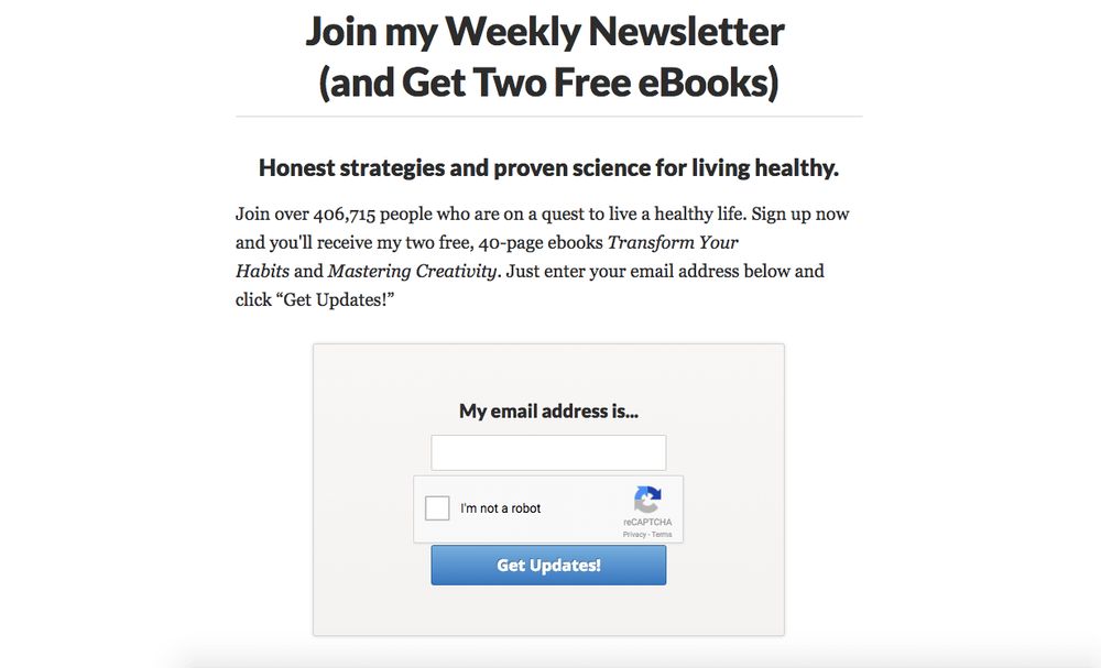
James Clear knows how to WOW his audience by integrating shocking social proof. By mentioning over 400,000 clients in the same boat, it can make you think twice about not joining.
Plus, the offering is pretty irresistible. James Clear offers two free eBooks if they subscribe to his newsletter. This is definitely one way to augment your email list!
7. Louder Online
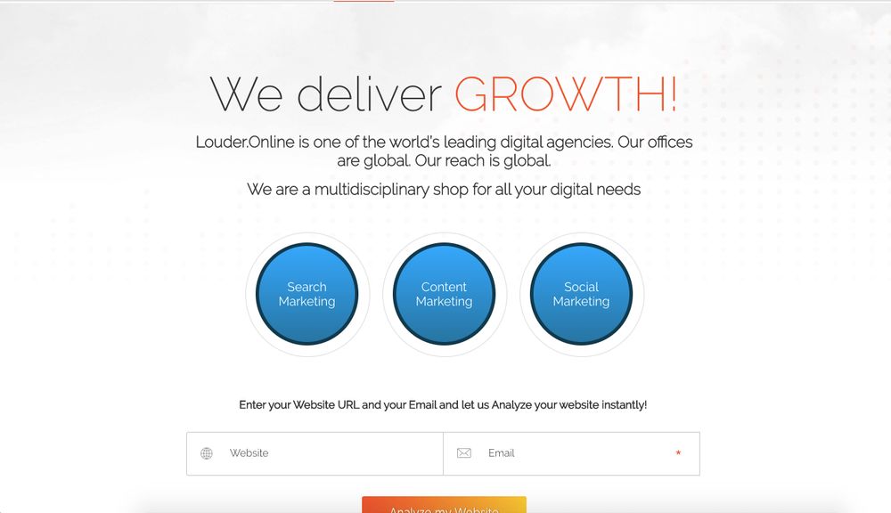
Louder Online banks on another strategy to make prospects sign up. Instead of giving away free eBooks or video courses, Louder Online instantly offers a free website analysis. All you have to do is provide your website and email.
This not only showcases your products and services from the get-go. But this tactic also generates leads without the prospects even knowing!
8. Sol Orwell
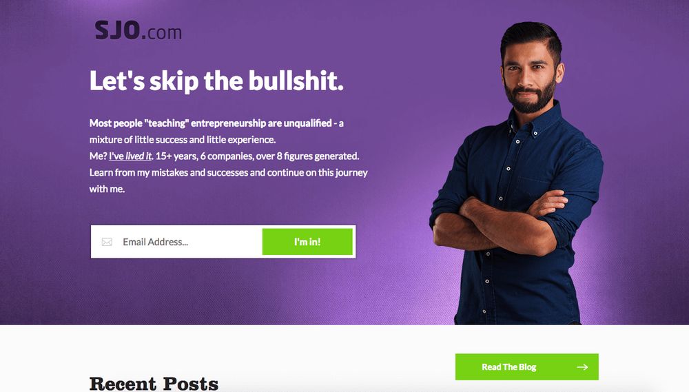
Here’s one of the landing page examples that breaks the mold. Instead of the standard headline, Sol Orwell pokes fun and profanity at his audience. But it’s the good kind of fun and profanity.
He points out how clients, unfortunately, hire some self-acclaimed entrepreneurs who don’t bring in results. And how he has a NO BS approach to teaching entrepreneurship. Apart from the headline, CTA is evident amidst the purple background.
9. GrowthSupply
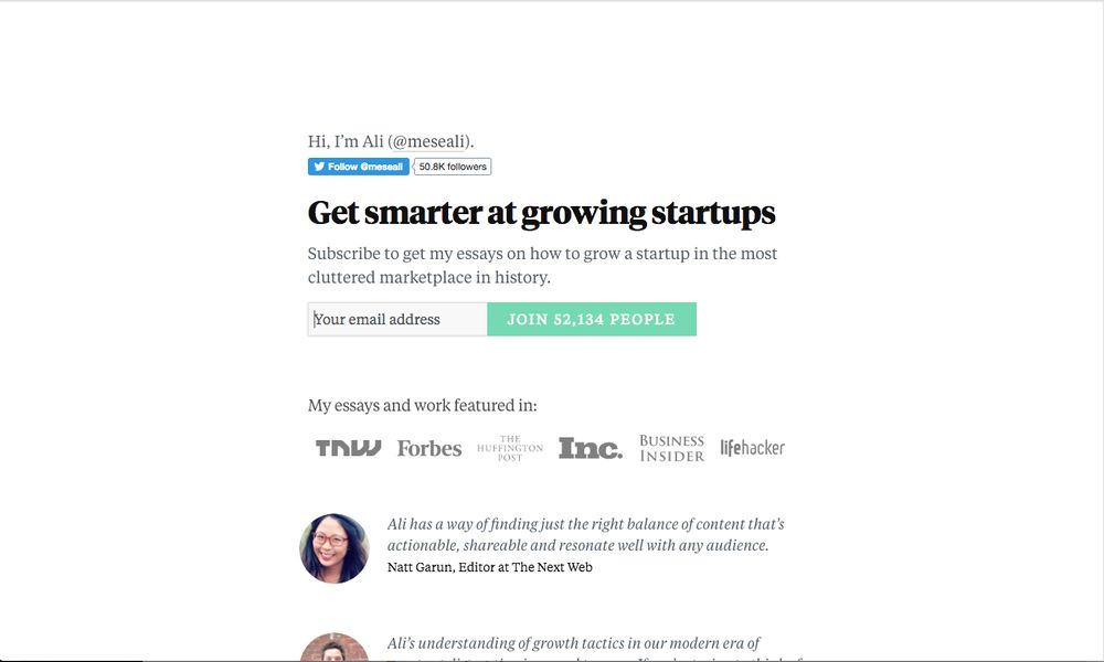
GrowthSupply’s brilliant use of social proof is evident across the landing page. First, they uniquely changed the CTA to “Join 52,134 people.” This is a new take on non-cliche CTAs. Then, they featured several prominent logos to show who the company has been working with.
Last but not least, the client testimonials help seal the deal for those who want to try out GrowthSupply’s services.
10. Email1K
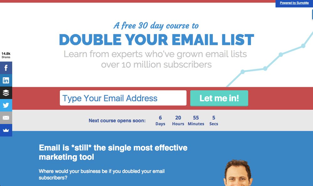
This is one of the landing page examples that has a smart technique and convertible strategy. Although there seems to be a lot going on here, your eyes are drawn to the headline first. Then it leads you down the capture form with a call to action that says, “Let me in!”
But another unique ingredient is a sense of urgency. The countdown would make you want to join the bandwagon immediately or else, you miss huge opportunities. The last sentence about emails being the most effective marketing tool is that last nudge to make clients join in. From the headline down to the bottom of the page, this landing page is built for conversion.
Related Post


Recent Comments
Interdum luctus accu samus habitant error nostra nostrum
Fletch SkinnerInterdum luctus accu samus habitant error nostra nostrum
Chauffina CarrBloke cracking goal the full monty get stuffed mate posh.
Fletch Skinner
![]()
Lead Pixel is an on-demand graphic design service that caters to fast growing teams, marketers, and agencies.
Copyright © 2020 Lead Pixels
Company
Resources
Our Capabilities
Community Initiatives