09 Oct
As the number of users on the internet continues to rise, companies have made an effort to make a digital shift. By doing this, most organizations would use social media, email, and advertising to communicate with their audience.
If organizations want to make an impact, they need to invest in advertising. The revenue for internet advertising in 2019 reached almost $125 billion. It’s expected to rise in the coming years, fueling the competition further to produce the best online ads.
Organizations must produce well-designed and captivating ads to attract attention. This way, they can increase brand awareness and sales.
In this article, learn the basics of how to design online ads. Plus, know the ten best performing online ads to inspire your ad designs and campaigns.
Quick Tips for Designing Online Ads
1. Keep Your Goal and Audience in Mind
Whenever you have an ad campaign, ensure that you integrate your goals and audience in the design. This will give you a better sense of how to craft your designs. Know what you want from them and understand what they want from you. This way, you can connect with them even in a single ad.
2. Make it Simple
Most online ads keep it simple. Don’t overcomplicate the design by adding too much text. Follow the 20% rule for this one. Don’t add too many colors, either. This will confuse your target audience, and you might lose them in the process. Plus, make sure to use a single call-to-action (CTA) button as well. Be straightforward on what you want them to do.
3. Test Multiple Designs
Even if you think the first design is the best one, you need to produce different designs. You want to test out which designs would perform much better. This way, you’ll know how to improve your designs for your target audience and goal.
4. Remember Different Online Ad Sizes
If you’re thinking about an online ad campaign, make sure to remember different ad sizes. You want to make sure that the sizes are optimized to each platform or channel.
Banner ads have different dimensions. The top three sizes for banner ads are:
- 300 x 250
- 336 x 280
- 728 x 90
On Facebook, the recommended ad size is 1200 x 628 px. Meanwhile, on Twitter, make sure to have a minimum width of 600 px. As for LinkedIn ad sizes, it’s 1080 x1080 px.
5. Use Imagery
Images have become crucial in processing information. You should have images that fit your messaging and goal, so your audience will remember your ad better. Ensure that it’s appropriate to your ad, and it captures your audience’s attention.
Now that you have the basics of online ads know how organizations employ these tips to create great ad designs. Learn the ten best online ads that have great design and generated sales and engagement.
10 Best Online Ads
1. Case-Mate
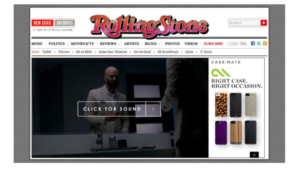
Vast Interactive handled Case-Mate’s online advertising campaign. The marketing consulting firm produced different ad designs. This allowed them to see different ad designs across various channels.
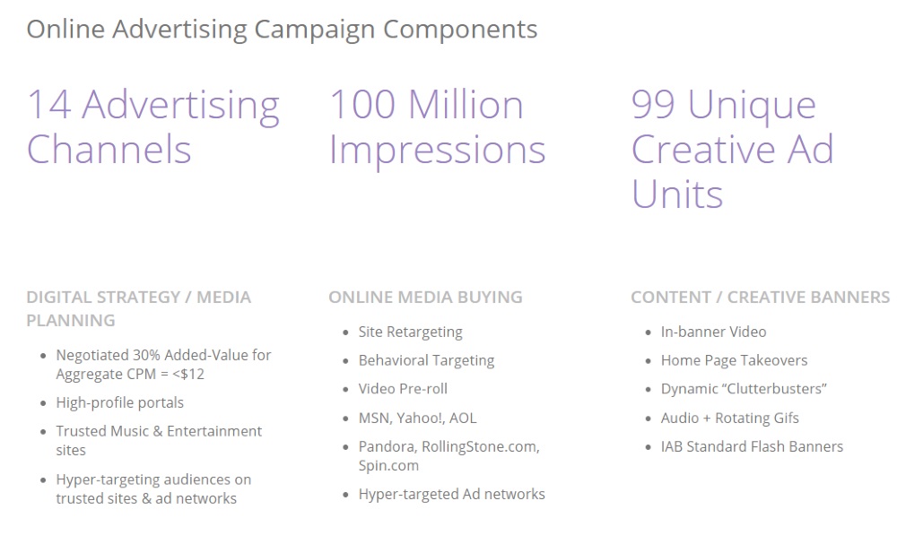
It also helped they had a celebrity endorser to capture their target audience’s attention. Since exposure was the goal for Case-Mate, they received over 100 million impressions.
As for the designs, they went for something simple. They featured different case designs to match the preferences of the target audience. In one of their banner ad designs, they “teased” one of their designs, so visitors of an external site can Explore more case designs.
2. Sony
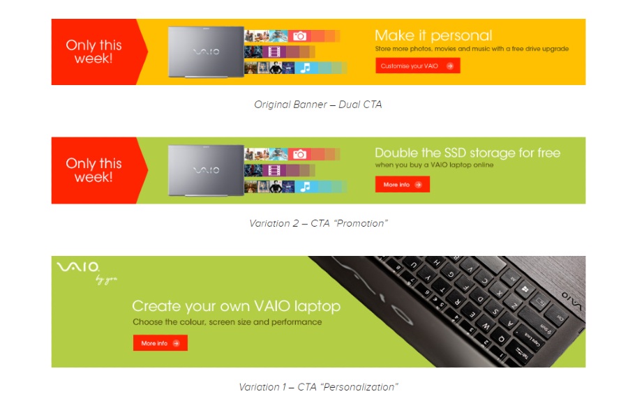
Back in 2014, Sony used Optimizely to conduct A/B testing for their ads. A/B testing is a common practice by companies to test which ad performs better. Based on the results, Variation 1 yielded more clicks than Variation 2 and the original banner. It performed 21% better.

Based on Variation 1’s design, using the Sony VAIO laptop as the only image on the banner made it more appealing. Plus, the copy integrated the word, you, establishing a connection to the target audience. Also, the use of a contrasting CTA button makes it stand out. Bonus points for Sony for even using a directional cue (the arrow). This will help the potential visitor get redirected to the website.
3. San Pellegrino
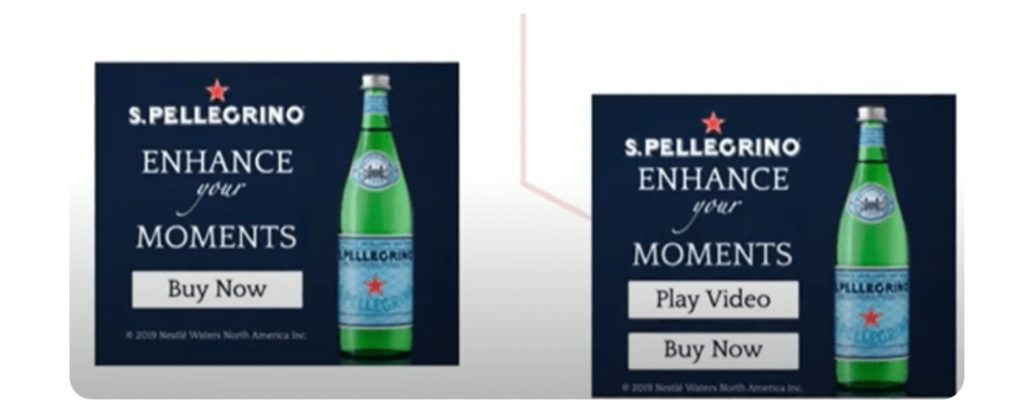
Like Sony, Digital Strategy Consulting helped San Pellegrino to conduct split tests for their online ad campaign.
According to Digital Strategy Consulting, they ran different display ads to raise brand awareness and increase sales. Based on the campaign, those with a single CTA line performed better than double CTAs. It performed 30% much better than the double CTA ad design. Since they used dynamic ads, they yielded 10% higher click-through rate (CTR) than using standard ones. They even lowered cost-per-click (CPC) rates to 14%.
The design is simple but effective. It used the San Pellegrino bottle as the hero image of the ad. They used the typography and branding seen on their website. This will make it easier to remember the brand. Plus, the white fill on the CTA is a good contrast against the dark blue background.
4. Citi
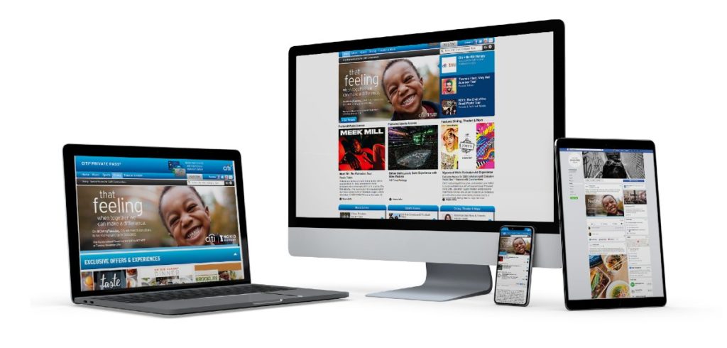
Citi planned a Giving Tuesday campaign in 2018. Their campaign ran across different channels in print and digital. The lead designer on the campaign mentioned they used a stock image from Getty Images to use as the hero image.
The campaign was a success, and they delivered some of the best online ads ever. Through Citi’s promotion for No Kid Hungry, the financial institution matched all donations ($100,000). Overall, No Kid Hungry raised over $465,000 and delivered 5,650,000 meals.
Even if they used a stock image, it was appropriate for the campaign. The design was simple, and it highlighted important parts of the copy like “feeling” and #GivingTuesday.
5. CME4LIFE
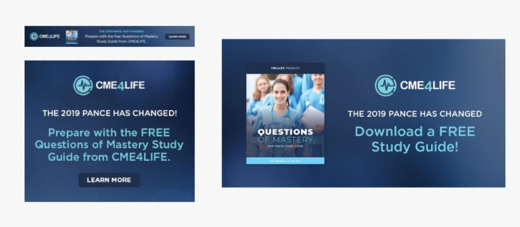
Parkway Digital created the ad campaign for the CME4LIFE. They executed a Facebook ad campaign, Google Adwords, and remarketing through banner ads.
For their Facebook ad campaign, they had a 1.3% CTR. However, they attained a 20% download rate on a study guide they were promoting. For their remarketing efforts, they received over 500,000 impressions in three months.
The designs of the ads look simple, yet they’re effective, as seen in the results. They included a photo of the guide in some of the ad designs. That’s helpful, so the target audience has an idea of how the guide looks like. Plus, as for the copy, they emphasized the word FREE. It’s good to do that to capture the audience’s attention.
6. Watchfinder
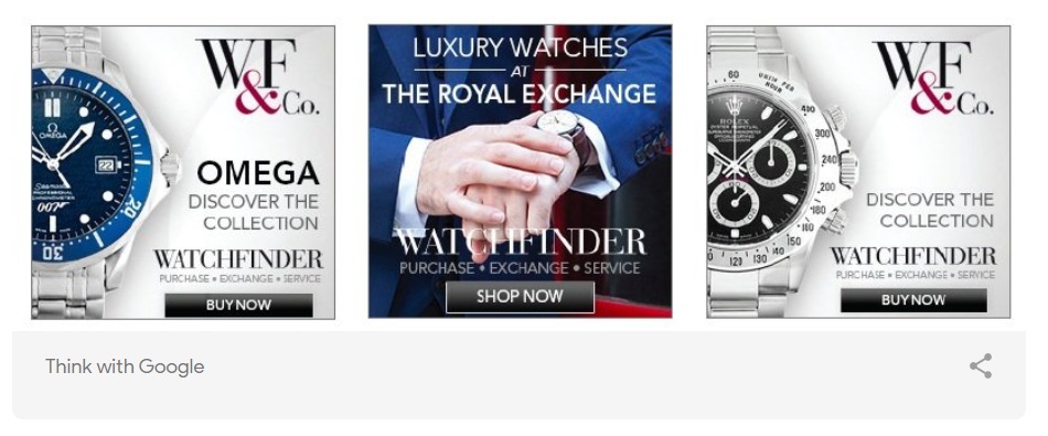
Periscopix helped Watchfinder use Remarketing with Google Analytics for their online ad campaign. The goal was to increase sales because of low intent. It’s considered one of the best online ads because it generated a 1300% ROI. Plus, it increased the average online value to 13% (previously 1%).
As for the designs of the ads, they used different watches that could pique the interest of their visitors. It’s good they used different watches to target different potential buyers. Plus, it’s also good they have another design to have a variety of designs to promote their products.
7. Hopper
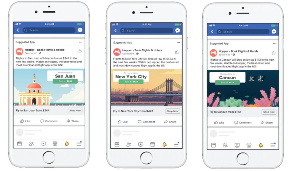
Hopper, like many other companies, used Facebook to conduct their online campaign. Hopper wanted to increase bookings on their mobile app.

For their campaign, they received impressive results. For one, they had a 70% increase in CTR. Plus, they had an 18% decrease in cost-per-app install. It’s a successful campaign.
Unlike most of the best online ads on this list, they used illustrations. Illustrations have become a trend in graphic design. Hopper executed well. They illustrated the known landmarks or places in the city they’re advertising. It’s a fresh take on the usual stock photo of those cities. It’s this way they stand out among the rest.
8. Lenovo
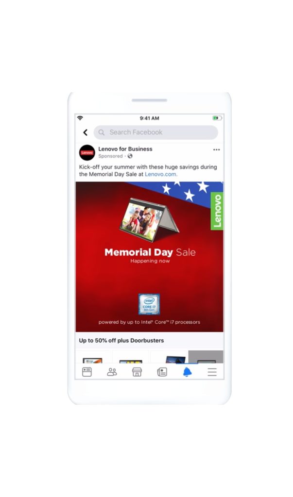
Lenovo also used Facebook to widen their reach and generate more sales for their Memorial Day Weekend in 2019.

The tech company yielded incredible results for the campaign. They generated a 10% lift in online sales, 6.4% offline, and 54% product page views.
The ad design is befitting the Memorial Day campaign because of the flag motif. It features one of their products. It’s good they added the Intel i7 image as social proof. Plus, it seems they applied visual hierarchy too. This way, it’s easier to view the ad in its entirety. This will then lead the user to browse products on Facebook.
9. Helix
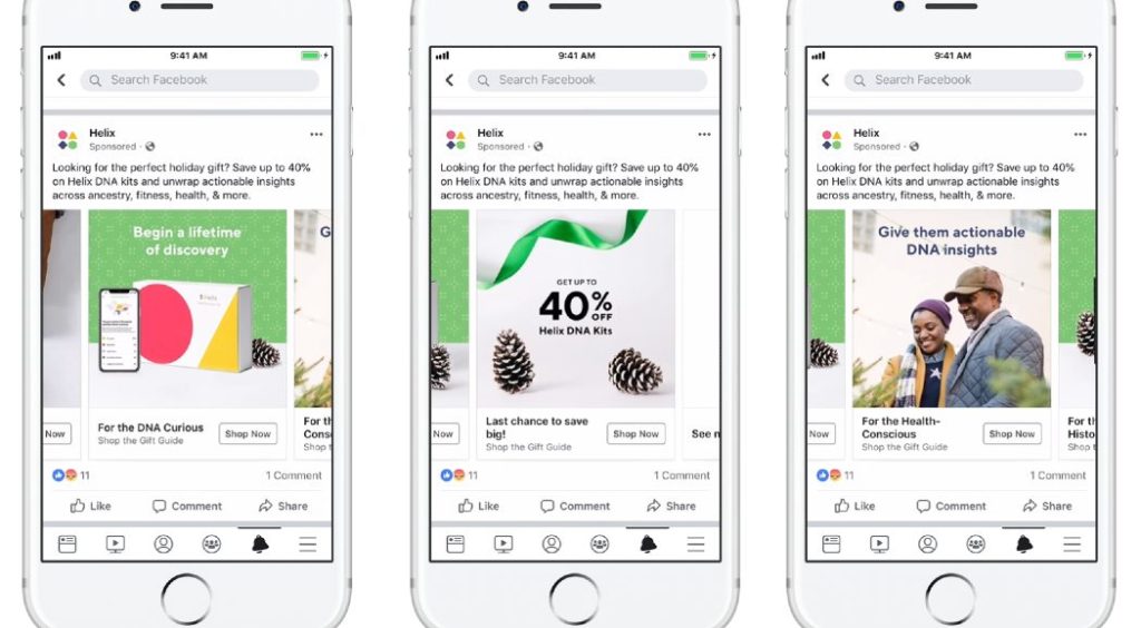
Helix used a combination of carousel, video, and dynamic ads for their Black Friday Facebook ad campaign. Their goal was to increase sales of their DNA kits.

As for their results, they saw a 5x increase in sales and a 2x increase in conversion rates.
For the ad designs, they used simple editing and typography. Yet, it still works. Plus, there are pinecones on the design to give it a holiday feel. In one of their ads, they just indicated the discount when they buy a kit.
10. SiriusXM Canada
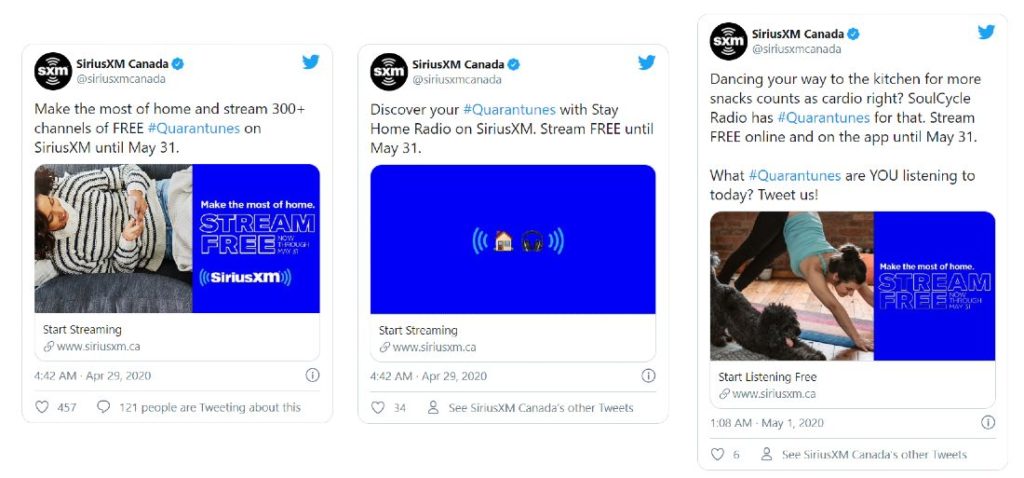
SiriusXM Canada used Twitter to advertise their free streaming program. They’re aided by different agencies to build awareness of the streaming program.

Their ad campaign was a success. They had almost 9 million trend impressions. Plus, they had 2.15 million tweet impressions. They yielded over 24,000 engagements.
As for the designs of their campaign, they used Twitter cards to customize their ad. They used a split-screen design. Split-screen ads aren’t executed by most. Still, it’s a good idea to stand out among the rest. In another design, they used emojis, to convey their message visually.
The Bottomline
The best online ads ensure simplicity. Plus, it’s better to be straightforward because you want the target audience to take action. You can yield the results you expect by taking inspiration from the online ads seen above. Where you decide to publish your ads, you should always keep your audience, goals, and messaging in mind. This way, you can have an effective ad campaign and increase CTR and sales.
You can achieve those by subscribing to Lead Pixels. Request online ads and receive a compelling design in return. Be a step ahead of the rest in your industry. Get started on a Lead Pixels plan now and start requesting your graphics.
![]()
Lead Pixel is an on-demand graphic design service that caters to fast growing teams, marketers, and agencies.
Copyright © 2020 Lead Pixels
Company
Resources
Our Capabilities
Community Initiatives