18 Sep
Business owners are always on the lookout for great marketing opportunities. And if they can find cost-effective ways to promote their brands, the better. One of the most valuable and surprisingly inexpensive marketing strategies there is is the use of emails.
A study shows that 59% of people say that marketing emails influence their purchasing decisions. This may be the reason that 93% of marketers use email to distribute content. If you still don’t use emails to advertise your brand, it’s the best time to do so.
Here are ten email design inspirations to get you started on your email marketing strategy:
1. Liquor.com
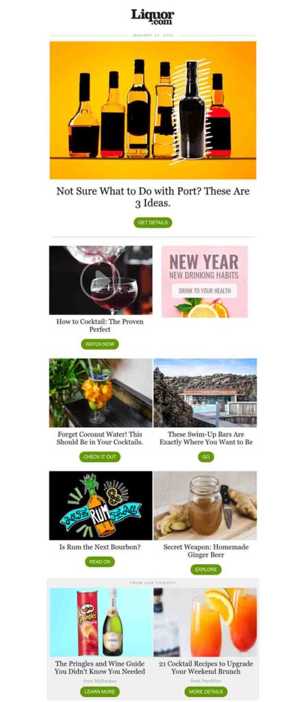
A website dedicated to liquor, Liquor.com sends emails to promote their sponsors’ products or offerings. The example above shows the use of photographs as well as graphic designs that are an excellent accompaniment to the articles on the site.
On average, research shows that professionals have more than 200 emails in their inboxes. They receive more than 120 new ones each day and only respond to 25% of them. The images that Liquor.com used in their email make it exciting and have a higher chance of being read.
2. Collaborative Fund

Compartmentalizing your email is a great way to make it look dynamic and easy to read. Collaborative Fund‘s email is a perfect example of giving snackable content that is more appealing to readers. They get to understand one section at a time, which is never dull.
The use of vibrant colors and a variety of fonts make the design look serious yet quirky. It has a good flow of information that’s easy to follow.
3. AYR
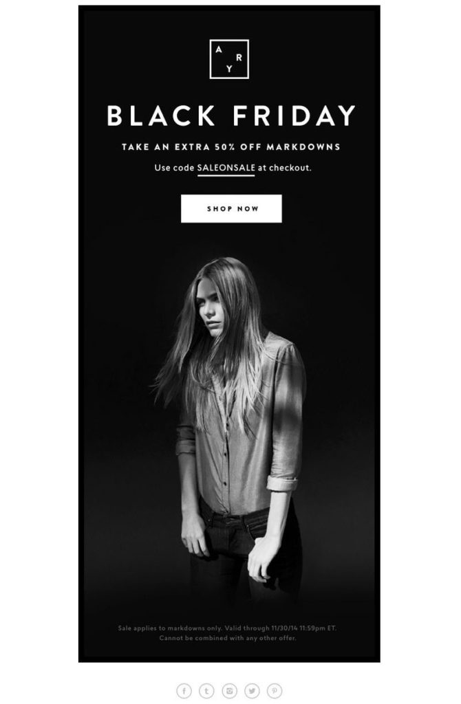
While bright colors are great at turning heads, black can also be the right color choice. AYR used a monochrome approach to their Black Friday email to emphasize the sale and add elegance and mystery to it. This design is pure simplicity as it has fewer texts but big on the impact.
All the information that the readers need is in the email. It doesn’t take up too much of the reader’s time, which is ideal for busy people.
4. Clinique
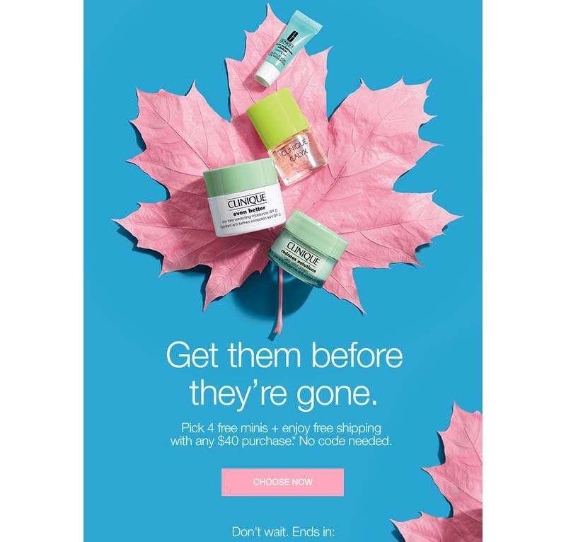
An example of a no non-sense design, this email from Clinique, tells it like it is. They got straight to the point and immediately led your eyes to the call-to-action button. The colors are contrasting, which stands out and gives an impression of life and vivacity.
Having an excellent CTA button is essential, and bringing the readers’ attention to it ensures that they won’t look past it. In this example, the offer is enticing, and getting it is just a click away.
5. Starbucks
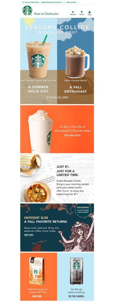
Showing your products or offerings straight away gives your readers a hint at what the email is about. This example from Starbucks shows a few of their products. If you’re a fan, you’ll quickly scan the email to see what’s in store for you.
The use of great design isn’t lost in this email design inspiration. You can see the beauty of the products and the layout, which leads the eyes to what’s essential in the message.
6. Noli Yoga
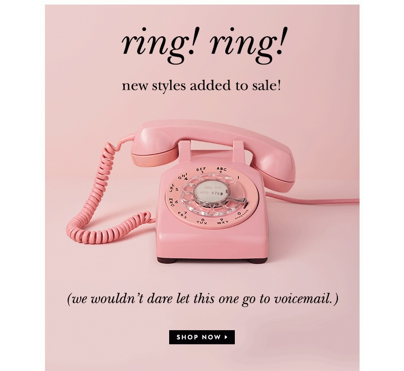
Creating negative or white space is a great way to pull the readers’ attention to your call-to-action button. Take inspiration from this email banner from Noli Yoga. It only has a rotary phone in the middle of the layout with all that white space around.
The novelty of the phone provides interest, while the text gets the readers into action. The design is simple yet quickly gets the message across.
7. Loft
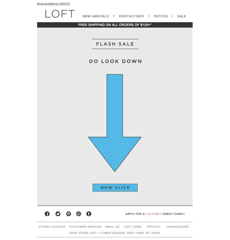
The average person receives about 40 emails per day. You need to go through all that noise for people to read your emails. Make sure that your email won’t take up too much of their time. Look at this email example from Loft.
It shows an arrow pointing down towards the Now Click button. Even their CTA is unique. It adds excitement, not knowing where it will take you.
8. MailNinja
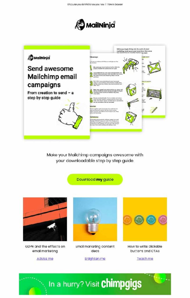
Structure is an essential attribute of a good email design. This one from MailNinja has a well-structured layout that makes it easy for the readers to navigate the content. It has a combination of illustrations and photographs that add to its appeal.
It has the right amount of images and text that’s never too busy for the eyes. Overall, a good email design inspiration that’s sure to be read through.
9. Honey
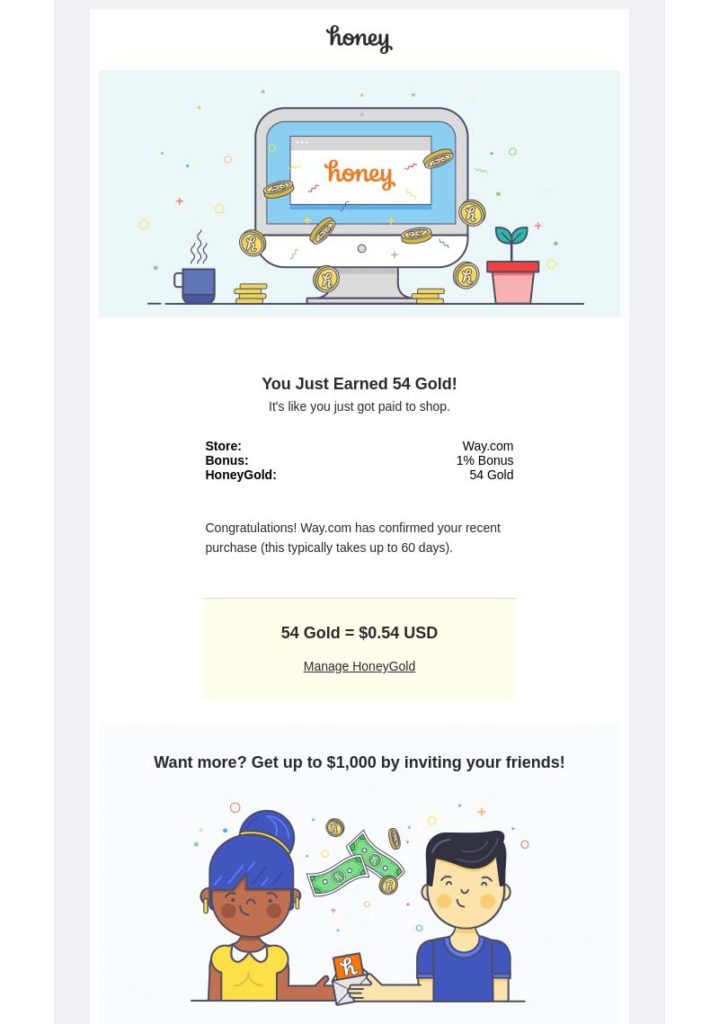
This email design inspiration from Honey is pleasing to look at. It’s light, fun, and uncomplicated. Referrals are a great way to increase your sales, and this email does it effectively. There are no heavy images, no blocks of texts, only cute illustrations added as necessary adornment.
Creating an email marketing strategy that has a human touch helps build better connections with your audience. This email adds excitement for readers to receive your emails.
10. Calm
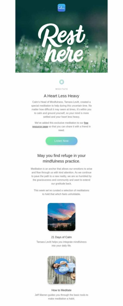
This email design inspiration uses the inverted pyramid structure that leads the viewers’ attention from top to bottom. Calm’s email starts with the words Rest Here in big, bold letters. It then draws the eyes downwards until it reaches the end of the email where the CTA is located.
From the imagery at the top down to the button, you’re encouraging them to check out your offer. This results in better brand awareness and possibly an increase in conversions and sales.
Why Graphic Design is Crucial
It’s easy for some business owners to think that email marketing isn’t practical. This may be because of the misconception that an email is only a bunch of texts. This is why graphic design plays a crucial role in making email a powerful marketing tool.
Adding compelling graphic design spells the difference between being ignored and getting people to take action. These email design inspirations all have graphic design that’s thoughtfully created.
For this, you need the services of Lead Pixels, an unlimited graphic design service that provides you with email designs to make your marketing more successful. Contact us today to know more about how we can transform your email designs.
![]()
Lead Pixel is an on-demand graphic design service that caters to fast growing teams, marketers, and agencies.
Copyright © 2020 Lead Pixels
Company
Resources
Our Capabilities
Community Initiatives