11 Sep
There’s a rise in online shopping and the launching of eCommerce stores. It’s estimated there are more than 20 million eCommerce sites globally. With that number in mind, it may be challenging to rise above the competition.
However, it’s still possible to increase sales and traffic by utilizing digital marketing for eCommerce strategies. When it comes to marketing, there’s content marketing, email marketing, affiliate, and so on. What many might not realize is the importance of design for most marketing strategies.
It has become crucial not only to make an aesthetically pleasing website and collaterals for other platforms. But it has contributed to influencing visitors and customers to purchase products on any eCommerce site.
In this article, I discuss how designs can enhance your digital marketing for eCommerce strategies.
Brand Identity in Digital Marketing
Your brand identity can enhance your digital marketing for eCommerce strategies too. Most brands would have a visual or brand style guide. It’s like a manual that companies follow to make their brand consistent everywhere. Anything you see on the website might appear on the packaging, email, social media, and other platforms.
Here are elements of a visual style guide to follow on any design:
- Logo
- Color
- Typography
- Photography & Illustration
- Tone and Voice
It’s best to follow your brand identity for retention, so you can convey your message to your customers, establish trust, and enhance customer loyalty. Plus, you should apply your brand identity to your website and other marketing strategies.
Website
An eCommerce website no longer just acts as the site where you post your products and have customers purchase items. It has become one of the most crucial and effective digital marketing for eCommerce strategies.
Here are the elements of an eCommerce website design:
- Navigation
- Responsiveness
- SImplicity
Every page and section can play a role in boosting revenue and generating leads.
Homepage
On your homepage, you should have the logo present immediately. Your logo is the first thing your customers see. It’s a visual representation of your brand. You can connect with your customers through this method.
Another thing to consider on homepage design is raising awareness for your company, products, and conversion rate optimization strategies. This way, once the visitor has explored enough, they can add a product to the cart.
Here’s the homepage from We Are Wild.
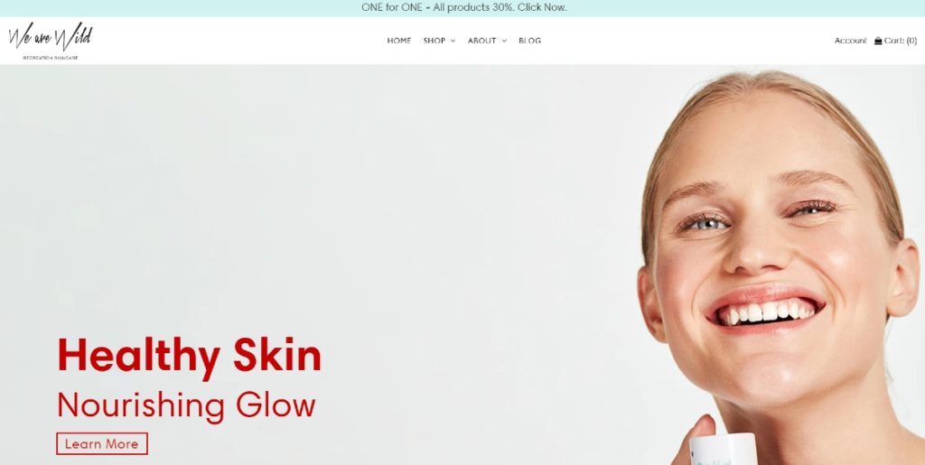
Above the fold, there’s a carousel that enables the visitor or customer to scroll. It’s so they get an idea of what they’re offering. As you scroll down, they observe the zigzag flow, so a customer’s eyes follow the CTA and the other high-quality images. They even have a header graphic design explaining their product further. Plus, they added social proof if customers need more convincing.
Landing Page
In most cases, one of the best practices for digital marketing for eCommerce websites is to use a landing page. Its main difference from a homepage is you’re enabling your visitor to act on something. Unlike a homepage, it aims only to inform the visitor of your products.
How can you incorporate the design on your landing page?
One of the most significant aspects of a landing page is the images. Above the fold, you need to have a hero image presented on the landing page. You want to connect with your customers the moment it loads. Persuade them to click on your Call to Action (CTA) button.
Other elements that you need to add on your landing page design are:
- Main headline and subheadings
- Copy
- Value proposition
- Contact details
- Social proof

Check out this landing page example from Veles. They use a carousel-type landing page where they use three different images, but six copies. It’s to test out which one would yield the most results when someone clicks on the Shop Now button. As you can see, the product takes center stage all the time.
About Us Page
Most About Us pages would include only the background, history, or overview of the company. To elevate your About Us page as a digital marketing tool, you need to include relevant keywords. Plus, you can add high-quality images of your company and products.
In some cases, a CTA would be on the homepage. It could appear as a pop-up, or it would be sections in the About Us page.
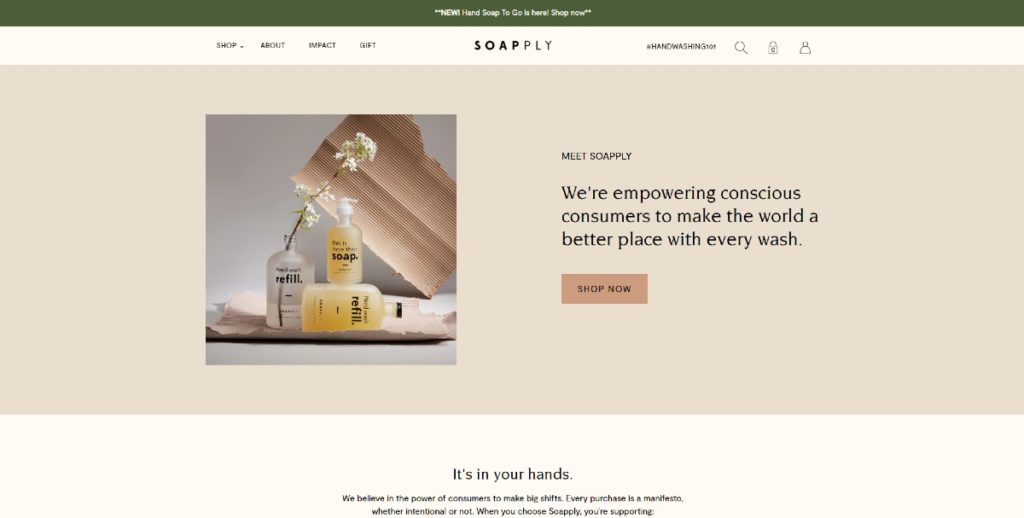
The Soapply About Us page adds a CTA on their About Us page. As you learn about their company, you’re given the option to explore their selection. It’s an excellent navigation technique, too, because if the visitor is lost, they can simply click on the “Shop Now” CTA button.
Blog Page
As part of your content marketing efforts, a blog page can increase traffic to your eCommerce site. Awareness is the first stage of the marketing funnel, and a blog page can create interest or consideration. It has become the go-to digital marketing for eCommerce strategy for many sites. Some have even reported success in doing this.
You can incorporate the design on the blog page by adding high-quality blog images. Plus, don’t forget to use blog image headers too. You may choose to have a custom graphic design on the header or use a high-quality stock photo relevant to the blog post.
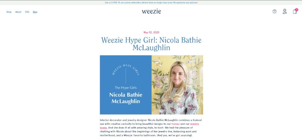
Here’s an example from Weezie Towels of how you can integrate graphic design on your blog. It doesn’t have to look artistic, but you can create a quick edit. They seem to integrate their company’s typography and color on the design too. That way, it’s consistent.
Product Pages
The product page can help customers decide if your product is worth buying.
A high-quality image will enhance your product pages. Your visitors will know what your product looks like. Over 90% of online shoppers consider photo quality as the most significant factor in purchasing an item.
Another essential part of a product page design is the copy. You need to write a persuasive and compelling copy that will convince them to click “Add to Cart.”
Plus, it’s good to add related products to your product page. This way, they could browse your other products, and they could view more products.
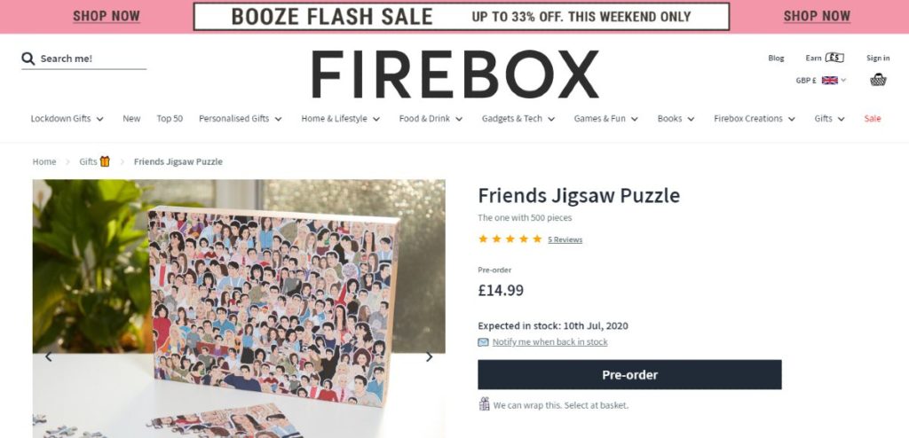
To illustrate this, take a look at how Firebox designed its product page. You can see a preview of the product and its pieces. They also added Reviews, so you can see how many people like the product.
If customers want to check out more items related to the product, they could click on “related” and browse for more products.
FAQ Page
You may not know it, but your FAQ page can strengthen your marketing efforts too. It can contribute to content marketing because you can use keywords there. As for the design aspect, a FAQ page would usually have:
- Concise copy
- Categorized topics
- Updated information
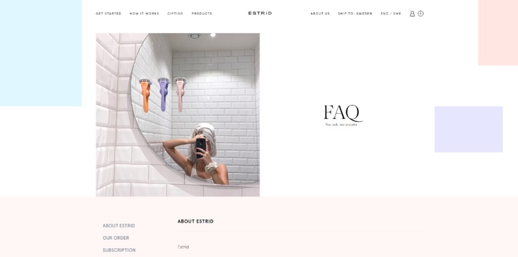
As you can see on the Estrid FAQ page, they use a hero image to give a preview of their product. They integrated the menu bar on the FAQ, too, so once a visitor has read the FAQ page, they can navigate to other pages. Plus, they organized the questions by topics also.
Most eCommerce websites would provide a sign-up form at the end of the landing page or homepage. This way, they can send email newsletters or updates. You could benefit from using email marketing to get referrals and boost sales. Thus, it has become one of the most widely used digital marketing for eCommerce strategies.
Design is a key factor in enticing your subscribers from reading your email to proceed to checkout.
If you’re using an email marketing strategy, you need to produce and design email newsletters.
In most cases, email marketing works because of the frequency you’re sending emails. And in some other cases, it works through triggers. For example, you’ll send a welcome email when they first sign up. Then, you can send out an email when you have a promotion or campaign. Another if someone goes to your site but abandons their cart.
Here’s an example email newsletter from Lush.
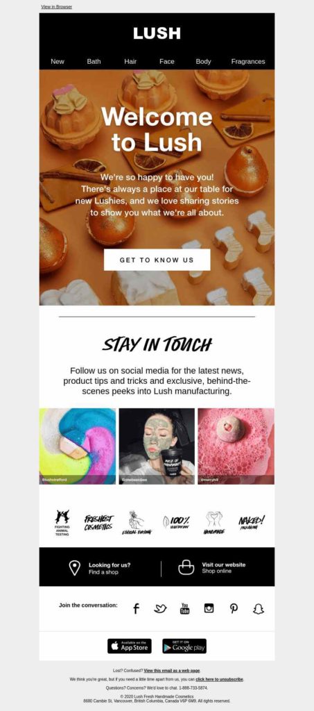
The email newsletter isn’t long, and it allows subscribers to click on the CTA button immediately. However, those scrolling down can still get a brief overview of the photos they post or share on social media. There are links to their website pages and social media profiles. Plus, the hero image is very effective. I can even smell it for some reason.
View the full design here.
Social Media
Social media has become a crucial digital marketing channel for eCommerce strategy. You can pique your prospective customer’s interest through social media marketing. One of the great things about social media marketing is engagement. You can gauge what types of posts attract likes and comments.
You have two ways to incorporate design on social media. One is for posting purposes. Another is to use social media ads.
Social Media Posts
Most eCommerce sites have a social media page. It’s an extension of the website. Plus, it’s a way for you to interact with your customers.
You can increase engagement by publishing posts such as:
- Sharing blog posts
- Reviews and testimonials
- Contests and promotions
- Infographics, graphics, and charts
- Quotes
- Product photos
- User-generated content
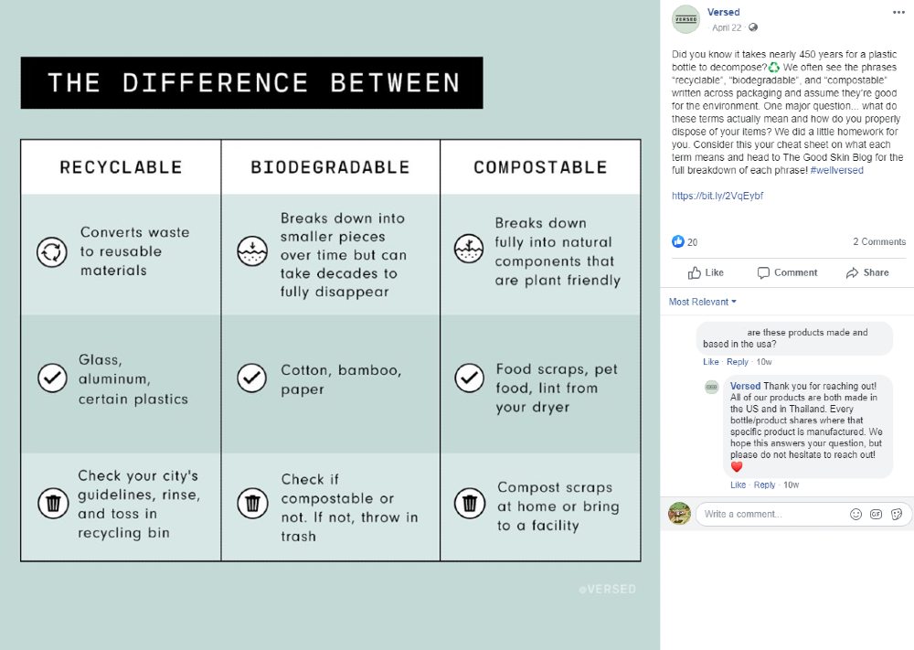
Versed cross-posted this photo from their blog post. It’s a simple graphic design that uses contrast and icons to make it impactful. It’s easy to understand by anybody who stumbles upon the image. Plus, they can click on the blog post they provided on the caption.
Social Media Advertisements
You can also run social media advertisements for your campaigns or to promote your products. This way, you can widen your reach and drive traffic to your eCommerce site.
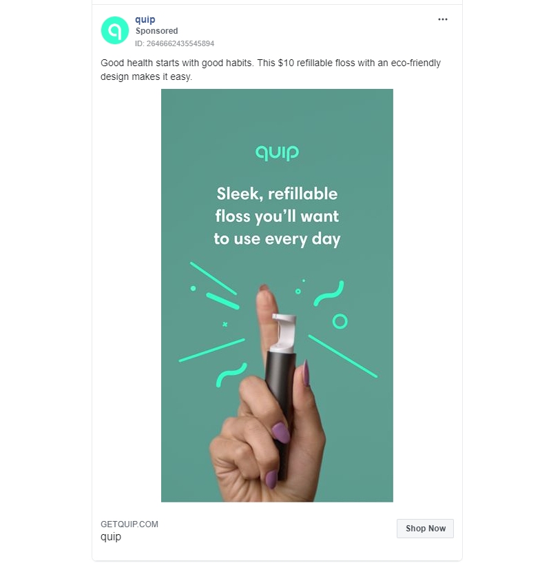
Check out this example from Quip. It’s a simple design where they featured the products, of course. But to make it pop, they added icons to captivate a viewer or visitor’s attention.
Final Thoughts
Design is no longer just for aesthetics. It’s to reel in prospective customers to purchase your products on your eCommerce site. That’s why you need to invest in eCommerce design that will convert visitors into customers. For this, you’ll need a graphic designer or a design service like Lead Pixels. This way, you’ll get professional and compelling designs not only for your website but other graphics also.
![]()
Lead Pixel is an on-demand graphic design service that caters to fast growing teams, marketers, and agencies.
Copyright © 2020 Lead Pixels
Company
Resources
Our Capabilities
Community Initiatives