31 Aug
A landing page has become a crucial feature on any website. It’s how you can generate leads, boost email sign-ups, or increase sales. You have only eight seconds to impress your visitor, so you need to have a well-designed and optimized landing page. This way, you can go above the 2.35% average conversion rate as well.
In this article, I enumerate 25 examples of website landing page designs that generated conversions, leads, and sales.
What is a Landing Page?
A landing page is often a separate page that will lead visitors or prospects to a business’s campaign. It’s called a landing page because you want a visitor to “land” on that page after clicking on an outside link or ad.
Elements of an Effective Landing Page
If you want to have a high conversion rate for your landing page, make sure to include these essential features:
- Clear Call-to-Action (CTA)
- Relevant and high-quality hero image
- Social proof
- An Impressive headline and persuasive copy
- Features and benefits
- Contact details
Examples of Landing Pages
1. ChupaMobile
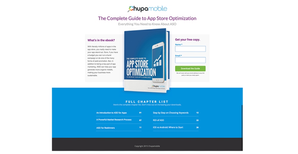
ChupaMobile tapped McGaw.io (formerly Effin Amazing) for their marketing and lead generation campaign. McGaw.io used a website landing page template from Unbounce.
They used a simple landing page design. They scaled the ebook since it’s the coveted item by those who want the guide. Plus, there’s also the form to get more leads for their email marketing strategy. The chapter list is a nice touch too, so before people could sign up, they could see the content.
Landing Page Conversion Rate: 44%
2. Titan PPC
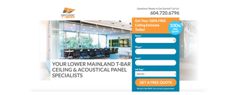
Titan PPC used Unbounce templates for their clients’ landing pages. In one of their samples, they also used a form on their client’s landing page to capture leads. For the design, they used complementary colors, which are pleasing to the eyes. They also used a hero image to give an overview of what they’re offering.
Landing Page Conversion Rate: 15% or more
3. Revecent
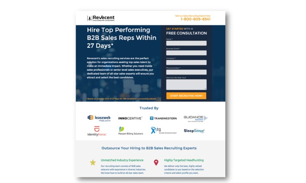
Revecent tapped Seven Atoms to increase leads and conversion rates. To do that, Seven Atoms crafted a PPC and landing page campaign.
On the website landing page, you can see a “trusted by” section. It’s a great use of social proof, so people signing up know that others have recruited with Revecent. They used contrast, too, on the form and the disclaimer, so it immediately catches the visitor’s eye.
Campaign Conversion Rate: 290%
4. Spaceist
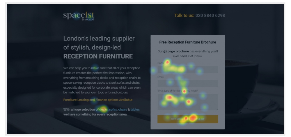
Clickboost created the Spaceist landing page. In this preview of the landing page, interested prospects can download the free brochure. They used negative space to put the focus on the form and copy. Plus, they used yellow to make the landing page pop.
Landing Page Conversion Rate: 14%
5. Transonic
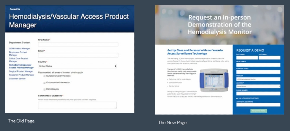
Kuno Creative worked on a campaign for Transonic. They put a side-by-side photo of the old and new landing pages. The new landing page is an improvement because they added a small hero image on the page. Plus, the form stands out because of a grid-like structure and the blue sticks out on the page.
Campaign Conversion Rate: 283%
6. International Culinary Center
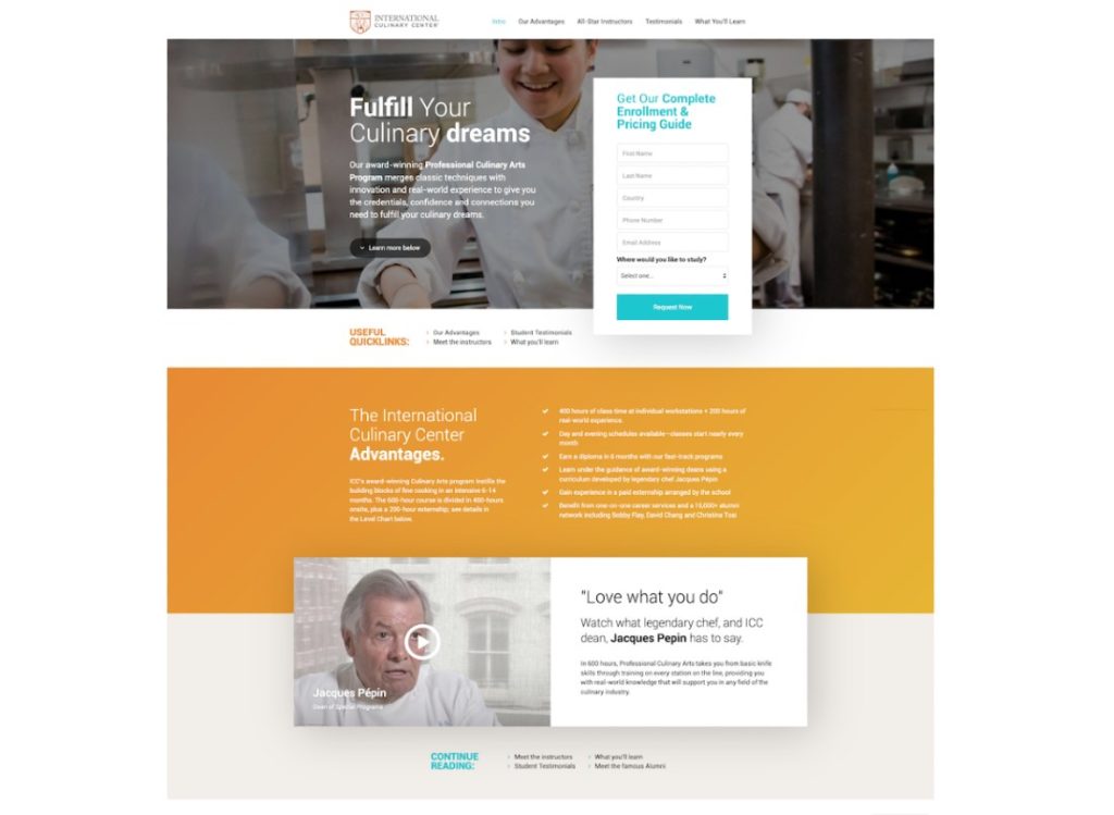
AdventurePPC gave the International Culinary Center a website landing page redesign that received high conversion rates. They created different landing pages to conduct the split testing.
The landing page designs created by the agency were clean and modern. They used different CTA variants for the designs. There was even a landing page with a different colored CTA button. The use of the hero images was good too. That way, they could capture the attention of those signing up for the program.
Highest Landing Page Conversion Rate: 284.06%
7. DIFF Eyewear
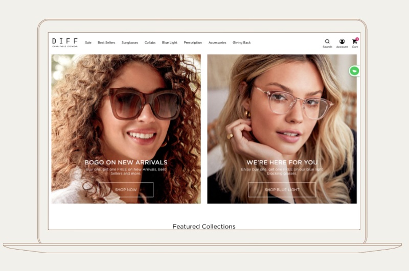
SplitBase helped DIFF Eyewear get more customers through their revamped landing pages. They use a split-screen landing page so that customers have options. The transparent CTA button is a nice touch, so it blends well with the hero image.
Landing Page Conversion Rate: 55%
8. BestSelf
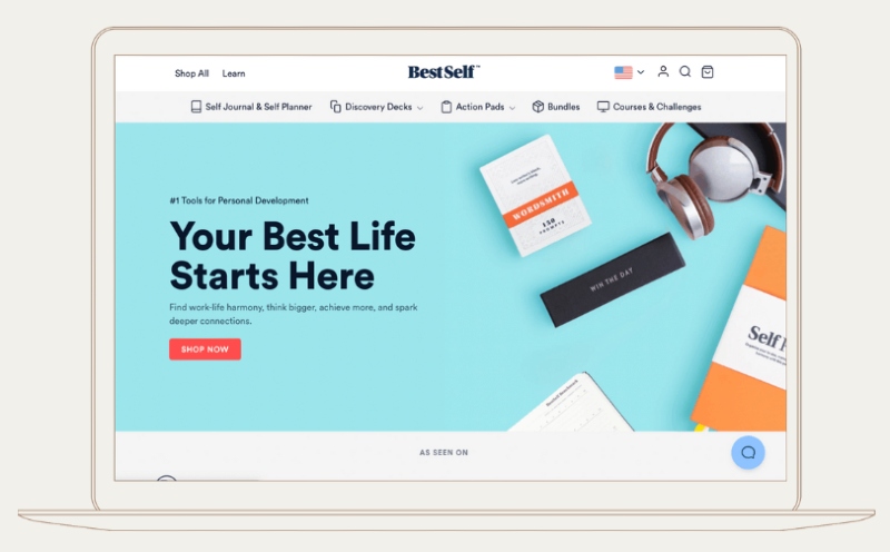
BestSelf is another SplitBase case study. As you can see, they used visual hierarchy with the text, enlarging the headline to evoke emotions. It’s great they used contrast as well with the background and the CTA button. So, it could draw attention to the button once the visitor views the page.
Overall Conversion Rate: 27%
9. Verz Design
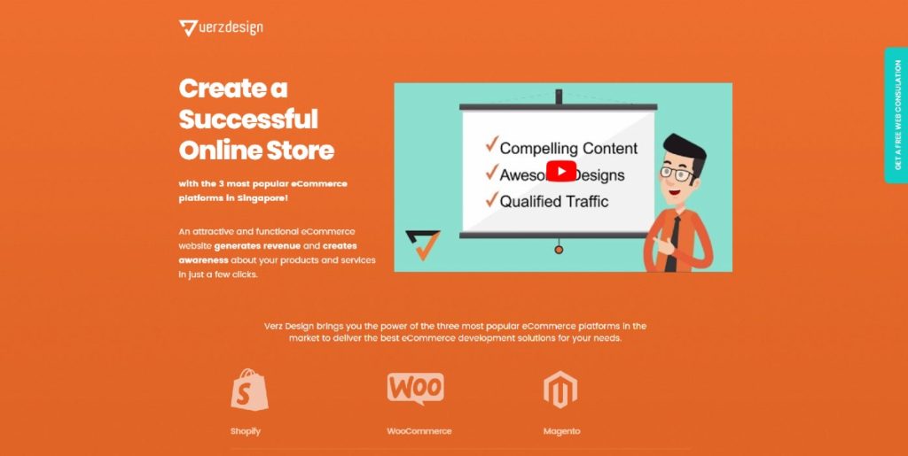
The Verz Design landing page uses video, as it’s an effective landing page conversion element. You can boost conversion rates up to 86% when you use video.
The CTA buttons aren’t visible above the fold, but it works so the visitor could scroll down and get more information about their site. The use of icons, images, and illustrations make the landing page come alive.
Landing Page Conversion Rate: 40%
10. Dollar Shave Club
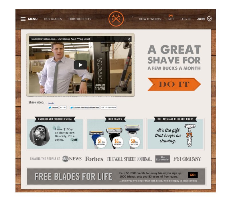
The Dollar Shave Club website landing page is one of the most successful landing page case studies. The use of video on the landing page skyrocketed sales within 48 hours that even its server crashed.
The landing page design has an impact because of the use of social proof near the bottom of the page. They also used a directional cue, an arrow, to lead the customer to get a “great shave” for the month.
Results: 12,000 orders
11. MaritzCX
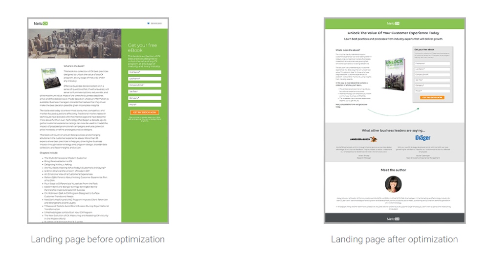
Search Laboratory provided MaritzCX with a cleaner website landing page design. On the before and after comparison, a visitor will most likely sign on the form of the revamped design because it’s decluttered, and the headline is prominent. Plus, they used different sections for easy browsing and navigation.
Landing Page Conversion Rate: 26.93%
12. HavWoods
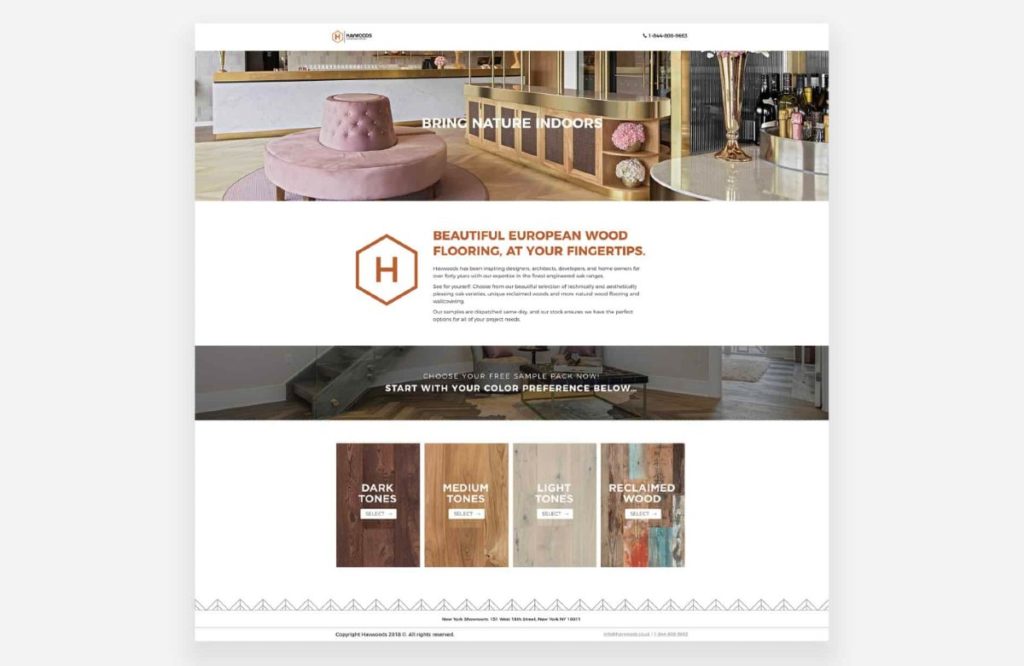
The HavWoods landing page will have visitors choosing a sample pack as they land there. The design is easy on the eyes because it’s not cluttered, and it uses grids. The large fonts also help in drawing the attention of the visitor to that section.
Landing Page Conversion Rate: 22%
13. Ancient Keto
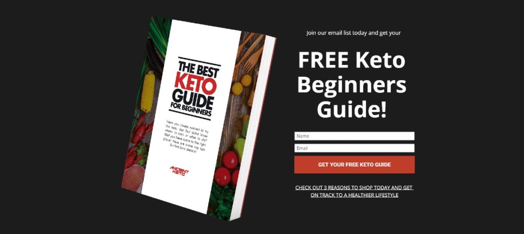
On the Ancient Keto landing page, they use not one, but three lead generation forms. However, their main form is for those who want to download their FREE Keto Guide. Above the fold, you’ll see that the photo of the ebook and their CTA button share the spotlight.
Landing Page Conversion Rate: 42%
14. Quilty Box

The Quilty Box website landing page design offers four choices for its prospects or visitors. They highlighted the subscription that will allow for more savings if visitors decide to subscribe. Also, they featured a small hero image of what the box can contain every month.
Landing Page Conversion Rate: 250%
15. USC Credit Union
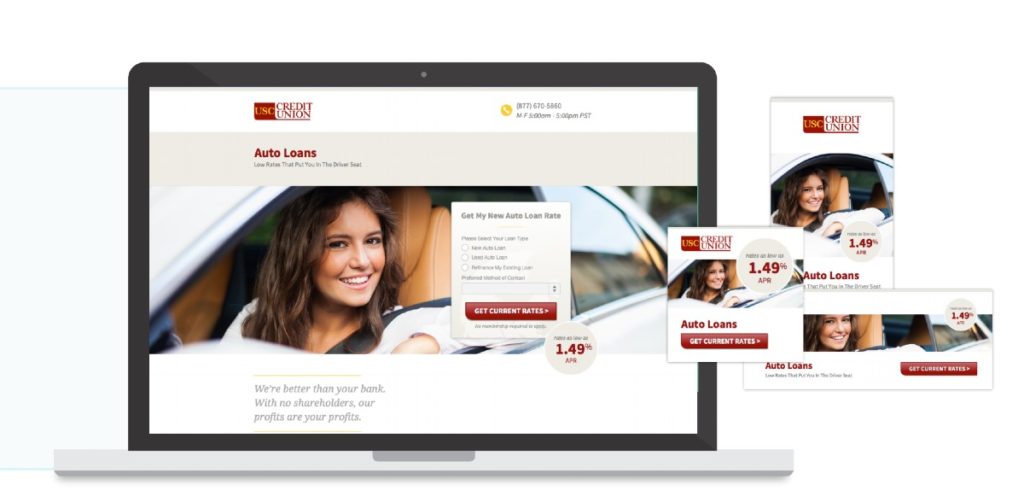
The hero image of the USC Credit Union landing page is a photo of a young adult or teenager. It shows that USC Credit Union aims to target that audience. Plus, the form on the landing page is straightforward and basic.
Anyone who has no idea of loaning can fill out the form and get current rates. Plus, they emphasized the low APR to entice the younger audience to ask for loans from them.
Campaign Conversion Rate: 174%
16. Le Tote
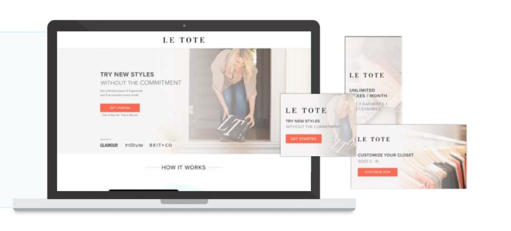
The Le Tote landing page has a modern look. Aside from the hero image, the CTA button is prominent, so that visitors can shop and navigate. The use of contrast is also evident in the headline, which will attract users. They added media recognition on the design, so visitors have an idea where they were featured.
Campaign Conversion Rate: 263%
17. Australia Wide Chauffeur Cars
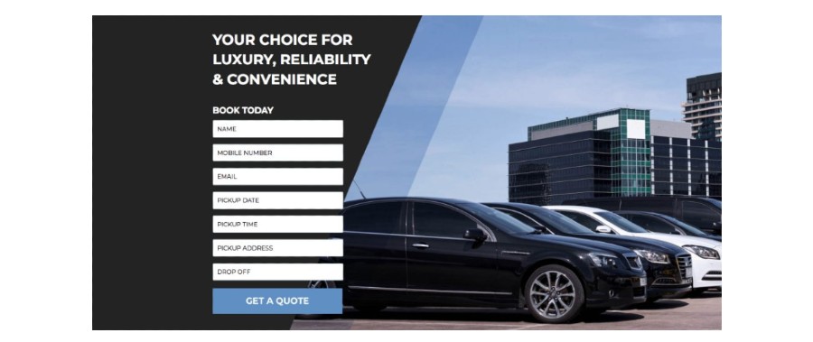
The Australia Wide Chauffeur Cars gets straight to the point. They present a form for those who want to request a quote. They also used a hero image featuring the cars they offer.
Landing Page Conversion Rate: 22%
18. SAP Analytics Cloud

Unlike other landing page designs on this list, the SAP Analytics Cloud (SAC) used an illustration for landing pages. The common theme of their landing page designs is space, so they used a black background but colorful illustrations to complement their copy. The yellow power words can entice prospects or visitors to click on the yellow CTA button.
Sign-ups: 1,563
19. Papworth
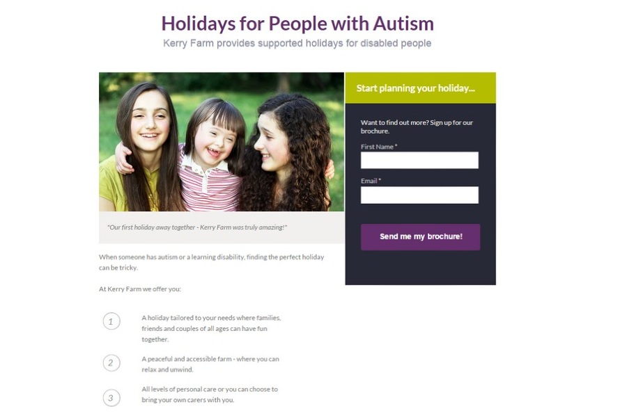
Before approaching Platypus Digital, Papworth already had a landing page. However, with the agency revamp, they simplified the landing page to increase conversions. The headline is also impactful on the landing page design. Plus, the CTA button on the form can capture one’s attention because of the color and how clear it is.
Landing Page Conversion Rate: 20%
20. The Scarf Shop
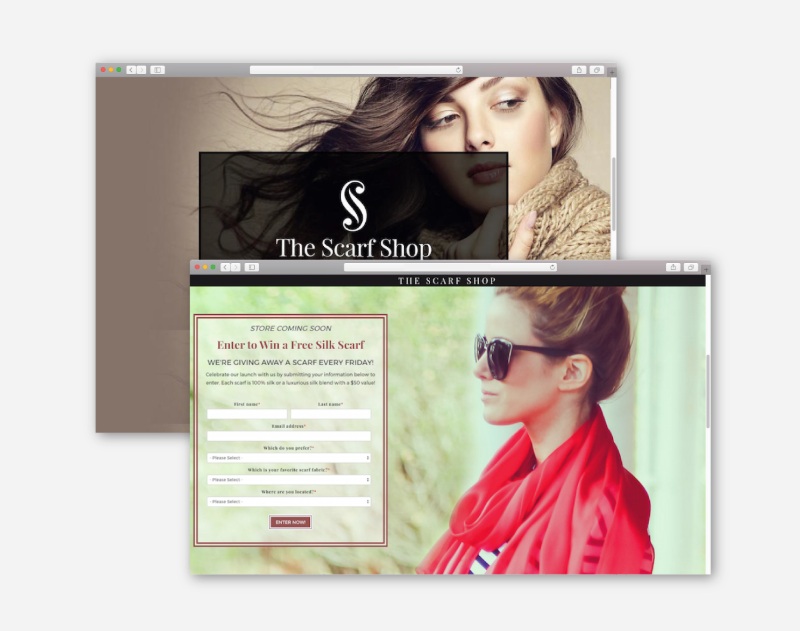
Eyemagine built a landing page for The Scarf Shop’s “Coming Soon” campaign. Most experts would agree that the most important element should be on the right. However, they put the form on the left side. So, the hero image, also acting as a visual cue, will lead the visitor to sign up on the form.
Average Landing Page Submission Rate: 226%
21. Park Springs
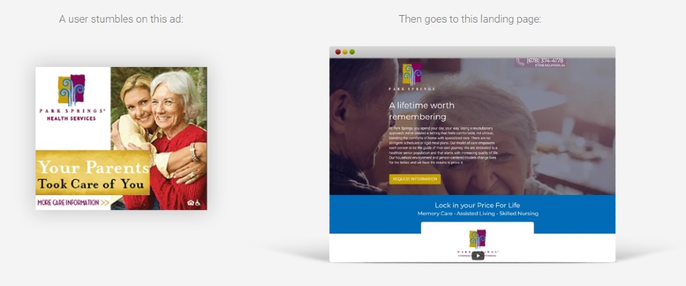
Cardinal Digital Marketing used A/B testing to create the Park Springs landing pages. In one of the designs, they used a simple form and a video to introduce Park Springs. In the other design, above the fold, the CTA button stands out. Also, they put the copies on the left side along with the CTA for easy browsing.
Leads: 1086
22. The Richmond Dentist
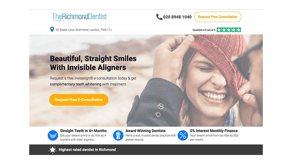
On The Richmond Dentist website landing page, Bounce Crunch made sure to use icons and data to attract customers to enhance the design. The use of reviews is a plus, so visitors have an idea of how trustworthy and credible the dentist is. Plus, the CTA can draw a visitor in because of the free consultation.
Landing Page Conversion Rate: 14%
23. Housekeep
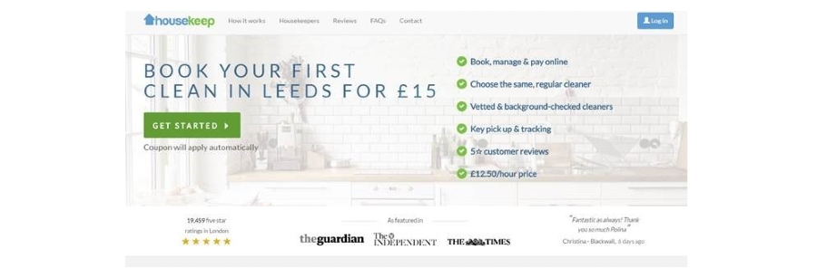
Merkle used geo-targeting on the Housekeep landing page. The design also used social proof like media shout outs and reviews. The CTA “get started” is clear, and the added subheading “coupon will apply” is a nice touch. It’s also great they added highlights of their service above the fold, so visitors know what to expect.
Landing Page Conversion Rate: 25.2%
24. Our Fish
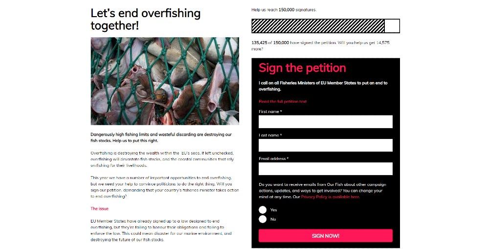
Our Fish tapped More Onion to increase email subscribers after signing a petition. On the landing page, they use a progress bar to indicate how many signatures they still need. They also provide a link to the petition for those who want to learn more information. Plus, they also used a compelling hero image to show the issue of overfishing.
Email Opt-ins: Over 40,000
25. Rio Salado Community College
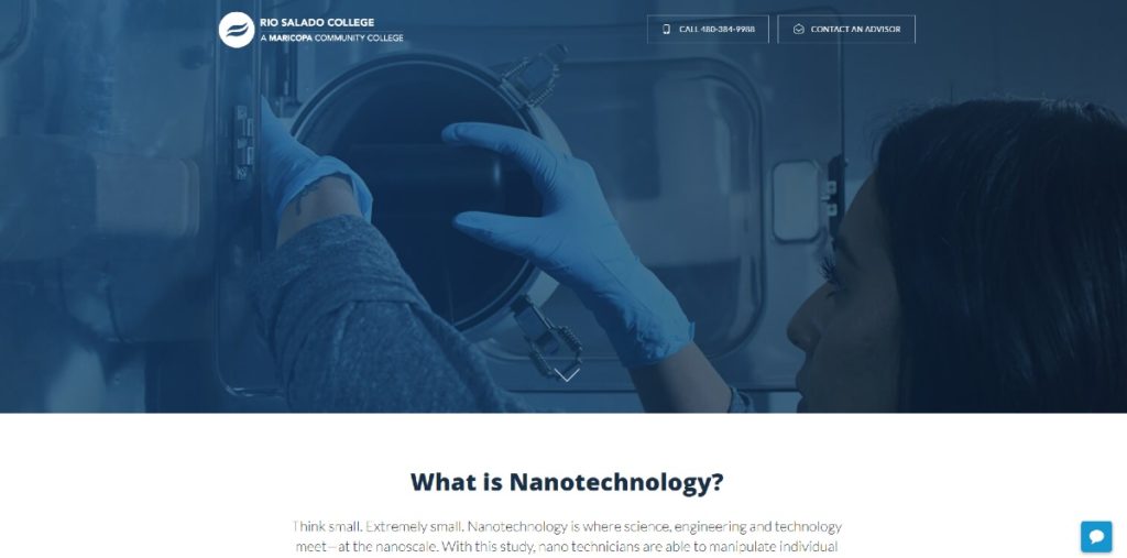
LaneTerralever provided an educational and information-filled landing page for the Rio Salado Community College campaigns. They designed an unconventional website landing page because the CTA is at the end, but the contact details are still present at the top of the page. However, it was still effective because of the use of videos to educate visitors and prospective students.
Campaign Results: Enrollment increase up to 4x than the last semester
If you want to have a high-converting landing page, Lead Pixels can design it for you. The designers will integrate all the necessary elements to get leads, sign-ups, or sales on your website.
It’s also an on-demand graphic design service, so you can request anything like social media graphics, marketing collaterals, and so much more. Click here to get started on your subscription.
![]()
Lead Pixel is an on-demand graphic design service that caters to fast growing teams, marketers, and agencies.
Copyright © 2020 Lead Pixels
Company
Resources
Our Capabilities
Community Initiatives