31 Jul
Consumer behavior is undoubtedly complex. It’s hard to pinpoint what triggered a consumer to purchase the product or subscribe to the service. But one thing is certain, though — emotion has a significant impact on the consumers’ buying decision. And this why emotional marketing is crucial in every ad design.
While brands strive to put their products and services front and center in visually appealing graphics, emotional marketing is sometimes omitted. This means marketers are losing considerable opportunities to convert leads into paying customers. That’s because likeability is one of the factors that rake in sales.
And if you’re not sure where to start, here are 10 ad design examples for inspiration. These ad designs will urge your audience to make a purchase or join the movement.
1. WWF (Climate Change)
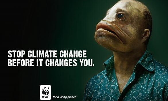
Marketers should take into consideration the various emotions that will trigger people. According to Psychology Today, consumers bank on personal feelings and experiences when gauging brands.
One emotion that is powerful enough to instill a tremendous effect is fear. Use this to your advantage, and you’ll reap the benefit of your ad design. Take this WWF Climate Change ad, for example. The combination of copy and ghastly graphics is enough to make people bat an eye. Though it’s simple, it has all the elements of impactful advertisement design.
2. Always (Like a Girl)
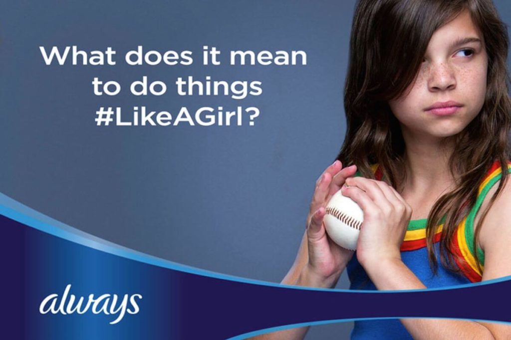
There is a century-old status quo that many people turn a blind eye on, and that is gender discrimination. Women are sometimes treated unfairly in the workplace, in public places, sports, and about any aspect of life.
If you want to make your ad design move mountains, start a movement. This will engage with other likeminded individuals who will willingly support your cause. However, make sure that it’s relevant to your niche.
And that’s what Always did, a company that sells feminine products. They started the Like a Girl campaign, and it works like a charm because it empowered many girls and female adults. Although it’s not going to change the world’s perspective about women, it’s certainly a step closer to awareness.
3. Nike (Colin Kaepernick)
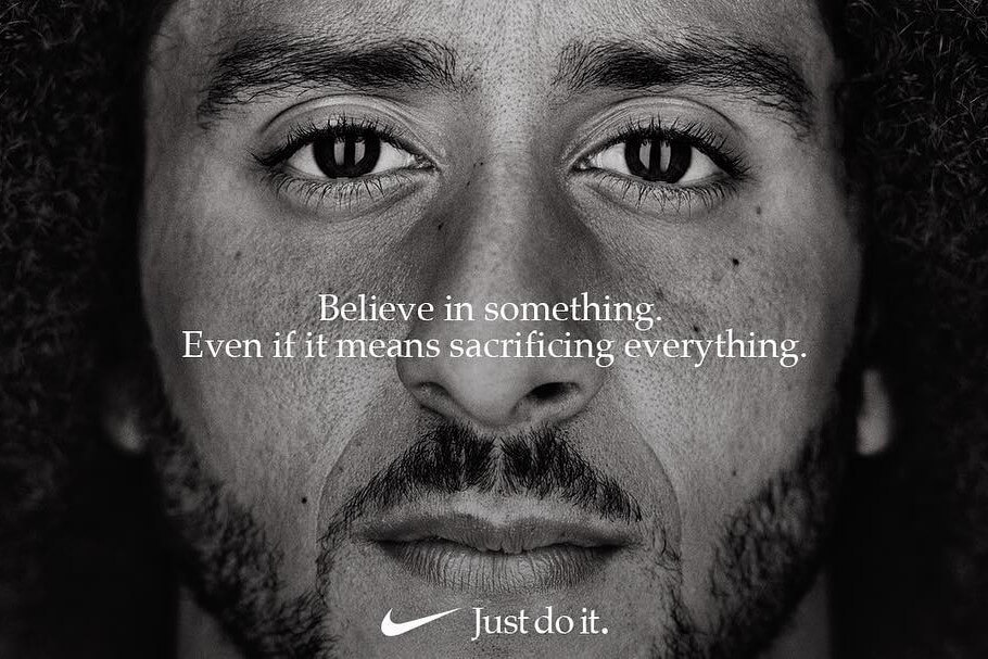
Another emotional factor that will make your ads move your audience’s hearts is righteousness. You always want to do what’s right, especially in the eyes of your audience. And Nike knows what principles they stand for through this Colin Kaepernick ad.
It shows that they support police brutality 100 percent. And although many have boycotted Nike for this stunt, the others are in awe of Nike’s brave marketing campaign.
4. PETA (Animal Abuse)

Another way your ad design can work to your advantage without heavy lifting is to tap into macro-influencers or celebrities. Consumers are drawn toward people they look up to. Whatever they say and promote, the fans will bow down to the message.
And PETA knows where they stand when it comes to influencer marketing. Through this animal protection poster, they tug at their audience’s heartstrings. When looking at the ad, a badass hip-hop artist and an innocent rescued puppy will melt your heart.
5. Gillette (Dad Test)
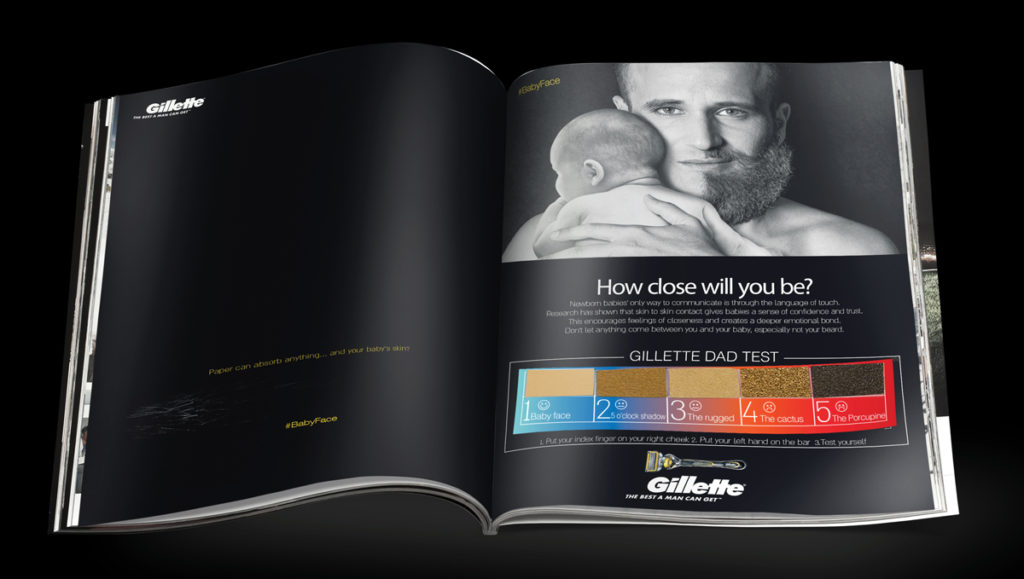
Gillette takes on personal experience with this print ad. Instead of focusing on their products, the company shows how vital skin-to-skin interaction is with babies. Babies feel uncomfortable when their father’s mustache or beard pricks them.
That said, Gillette shows a father’s half-shaven beard. The caption also triggers a sentiment, “How close will you be?” That means not shaving your mustache or beard might mean your little ones might not enjoy your touch or presence.
6. Calvin Klein (Sex Sells)

If there’s one thing that’s bound to sell in marketing regardless of circumstance, it’s sex. You want to tug at your audience’s physiological needs to make your ads sell. For instance, you can make your graphics incite particular feelings the moment your audience sees it.
Calvin Klien has been releasing provocative ad designs that work. As an underwear company, you want to portray how your products are used. In this case, underwear is something very private, and this shows a sexy half-naked model laying on a couch with an insatiable look.
7. Safe at Home Foundation (Domestic Violence)
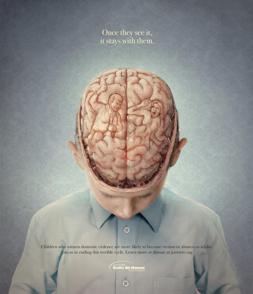
Whether you’re selling a product or starting a movement, it’s always recommended to use compelling graphics to get your message across. And this one is an example of a graphic design that makes heads turn.
Safe at Home Foundation’s ad design with a boy’s open head, exposing his brain, is somewhat distracting. But once you look closer, you can see that the shapes of the parents take form. It indicates that children will remember any domestic violence until their adolescence.
8. IKEA (Shelf)
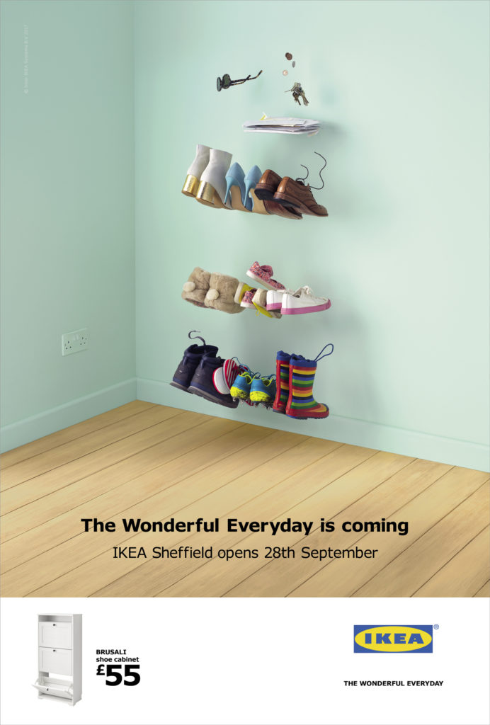
Instead of putting an actual IKEA shelf to show off to their audience, IKEA does it differently. They went the other route by seemingly touching on their audience’s pain point. Homeowners can sometimes be overwhelmed with too much clutter at home. In this case, shoes can be in a haphazard fashion, especially without a shoe rack.
That said, IKEA shows off an invisible shoe shelf with all the pairs of shoes, envelopes, and sunglasses arranged. This indicates what their prospects are missing and clearly shows how IKEA’s shelf can resolve a pain point.
9. Lego (Empowerment)
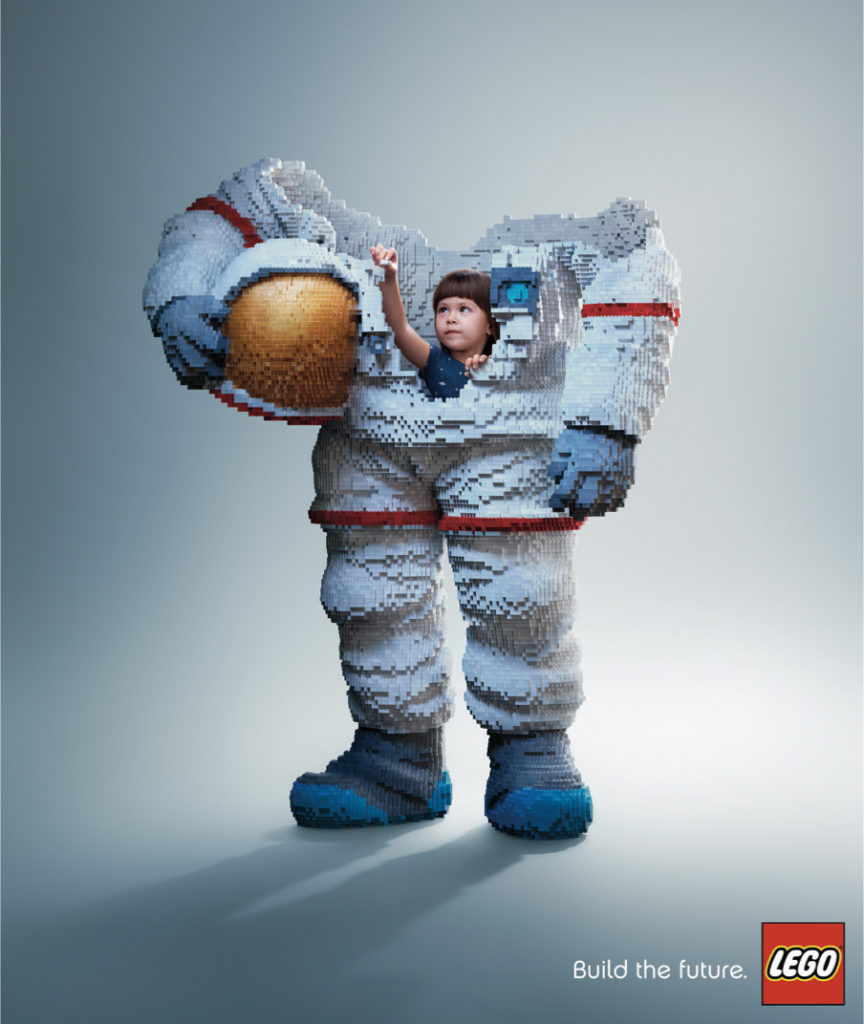
Another ad design technique that can move the public’s hearts is by making the impossible possible — at least in an inspiring manner. Lego indicates how their products can help kids unleash their creative imagination and hone their problem-solving skills.
The graphic design is extremely eye-catching, and it conveys a clear message that Lego’s products are perfect for children.
10. Coke (Share-a-Coke)
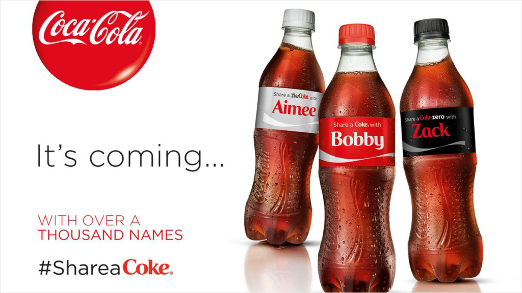
You also want to incorporate marketing psychology into the mix. By adding a fear-of-missing-out effect, your audience will scramble to get first dibs on your products or services.
Here, Coca-Cola started a Share-a-Coke campaign, which allows consumers to send personalized bottles to their favorite people. The catch? There are only over a thousand names available! This creates a sense of urgency that makes your audience act.
![]()
Lead Pixel is an on-demand graphic design service that caters to fast growing teams, marketers, and agencies.
Copyright © 2020 Lead Pixels
Company
Resources
Our Capabilities
Community Initiatives