19 Oct
Before clients take a bite out of a restaurant’s culinary offerings, they first have to feast their eyes on its menu.
That said, restaurant menu designs are the front and center of many ventures’ graphic design assets.
And with statistics telling us that it only takes 0.05 seconds for a person to form an opinion based on visuals, you’ll definitely want to make each millisecond count with your design.
If you’re looking for inspiration for your food list, savor these ten restaurant menu design ideas that look good enough to eat!
1. Combine Colors and Lines
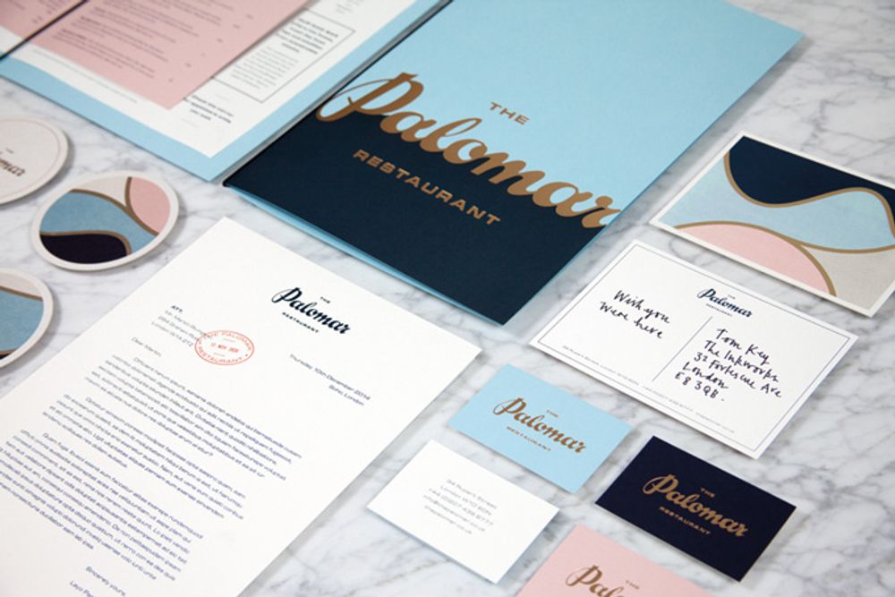
This menu design for The Palomar in London has an art deco vibe that looks both playful and classy. The wavy gold lines stand out from the color palette of Oxford blue, sky blue, sand, and baby pink. The menu itself is minimalist, so as not to compete with the prominent design of the menu jacket.
2. Add Culture
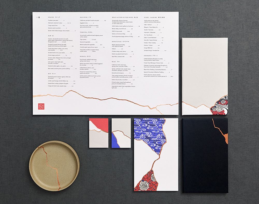
If you’re looking for creative menu design templates, then you might want to consider incorporating culture and tradition. For instance, this menu of a Japanese restaurant in Leeds called Issho takes inspiration from a custom from the Land of the Rising Sun.
A tradition called Kintsugi pertains to repairing a broken thing with lacquer dusted or mixed with powdered silver or gold. Using the Kintsugi effect on the menu design adds a deeper layer to the restaurant’s brand identity.
3. Experiment with Shapes
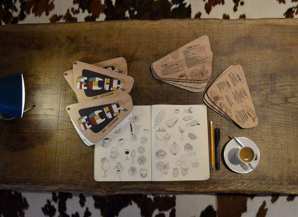
Searching for sample restaurant menu template options online will probably take you to rectangular layouts. But don’t let that limit your imagination!
For example, this menu for a Parisian bistro called L’ECIR features a unique round-edged quadrilateral shape you probably won’t see anywhere else.
4. Add a Dose of Sophistication
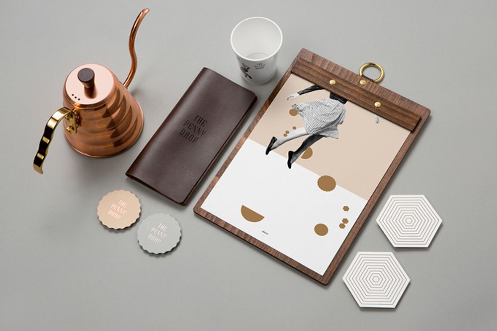
Sophisticated doesn’t need to be dull and boring. And this artistic number from The Penny Drop in Box Hill, Australia, is proof of that.
If you want a restaurant menu design inspiration, then this will teach you that a neutral color palette and a grayscale photo can make for an exciting visual! If you use it with the right shapes, lines, and artistic style, that is.
5. Go Vintage
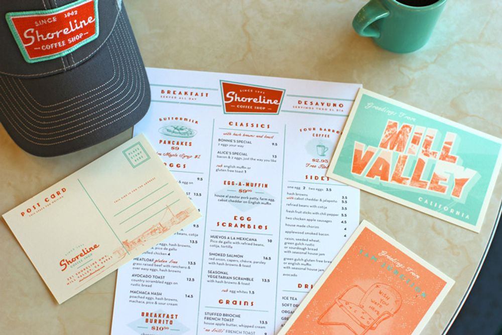
One look at this menu for Shoreline in Mill Valley, CA, and you know you’re in for a vintage Americana diner experience. The aesthetic alone will make you crave pancakes, fries, and a huge glass of milkshake! The color palette, shapes, and font all work to exude a 50s vibe without overwhelming the eyes as some of its counterparts may tend to do.
6. Don’t Shy Away from Print
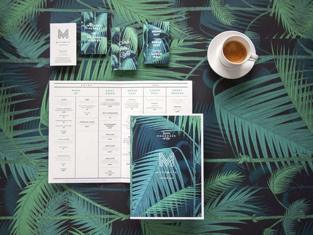
While many restaurant menu examples from Paris try to go as minimalist and classic as possible, Matamata went the opposite way. In fact, it embraced the same dark green palm print as the wallpaper in the restaurant. And as expected, the food list inside features a minimalist and simple set of colors, lines, and layout.
7. Play with Format
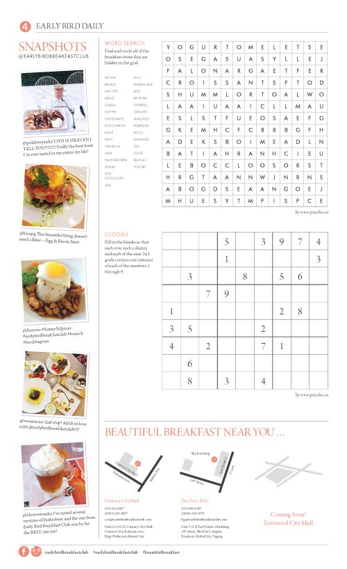
Many people eat their breakfast while reading the newspaper (or in the digital age, browsing their socials for news). And this menu for the Early Bird Breakfast Club is inspired by that morning habit.
The material was crafted to look like a broadsheet, complete with a few articles and even Sudoku and Word Search sections! This is one of those restaurant menu designs that help make a dining experience hard to forget.
8. Consider Quirky Illustrations
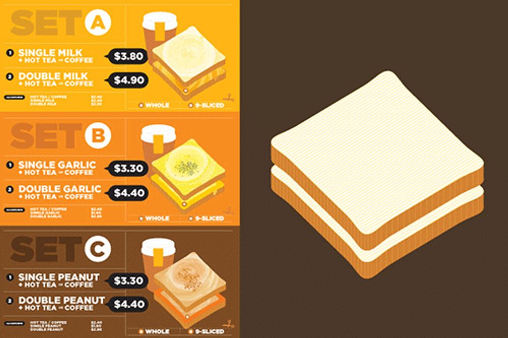
Most restaurant menu designs use actual photos to illustrate what the item looks like. This visual for Woobbee, however, features cute illustrations of sandwiches and coffee cups. Interestingly, the figures were crafted very well that they stimulate the appetite without having to look all-that realistic.
9. Use Different Background Colors
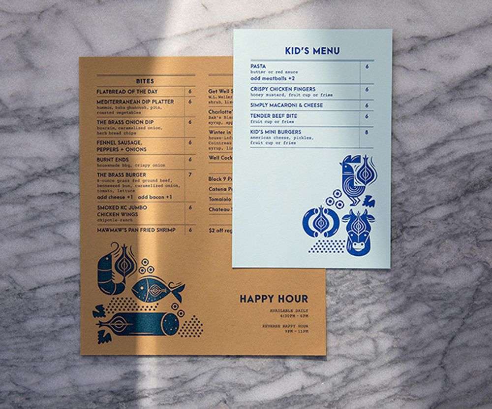
The Brass Onion’s menu uses two types of papers – a brown one for the bites, and a white one for the drinks and kid’s choices. Despite the difference in background colors due to the type of paper used, the menu sets look cohesive, thanks to the dark blue text and illustrations present in both.
10. Highlight the Food
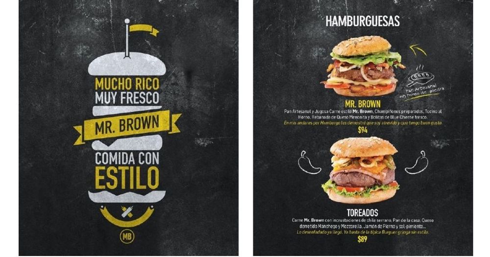
Sometimes, there’s no way to convince the viewer to order something other than showing them what it looks like. This menu for Mr. Brown features photos of their fat, chunky, juicy burgers filled with all the works. Now, any burger lover would find it hard to resist that sight!
Key Takeaways
Taking a cue from the examples above, here are some crucial tips to keep in mind when creating a menu:
- Use color theory and color psychology when picking out the color palette for your menu. For instance, green gives the viewer the impression that the food is fresh, while orange and red stimulate the appetite.
- Take note of the “golden triangle” in design. According to this theory, people typically look at the center of the design before looking at the upper left side and then the top right.
- Make sure that the menu design reflects who you are as a brand. For instance, if you’re projecting minimalism in your food and interiors, the menu should too.
- That said, the design should also reflect the kind of cuisine you’re offering. It would be quite confusing to see colorful Mexican fiesta images on a restaurant menu that offers ramen.
TIP: Research says taking the dollar sign from the menu encourages diners to spend more because they do not associate the value of the food with money. So, instead of writing $10, simply use 10.
Some restaurant newbies try to create the menu design by themselves to save on professional fees. However, it most likely gives you the results you’re aiming for. As Jaguar Land Rover CEO Ralf Speth once said, “If you think that good design is expensive, you should look at the cost of bad design.”
If you need professional services well-versed in restaurant menu designs, Lead Pixels can help. Offering unlimited graphic design for a flat monthly cost, you can have all the designs you need at a fraction of a price. Sign up today and see what we can do to help you grow your food business.
Recent Comments
Interdum luctus accu samus habitant error nostra nostrum
Fletch SkinnerInterdum luctus accu samus habitant error nostra nostrum
Chauffina CarrBloke cracking goal the full monty get stuffed mate posh.
Fletch Skinner
Categories
![]()
Lead Pixel is an on-demand graphic design service that caters to fast growing teams, marketers, and agencies.
Copyright © 2020 Lead Pixels
Company
Resources
Our Capabilities
Community Initiatives